Design Jam · Capco
Design Jam with High-tech Commercial Bank
A 2-day workshop that brought together 23 data experts to envision an executive data dashboard - using collaborative design activities to align on strategy and generate a concept together.

Overview
In a rush? Here's the TLDR.
The Design Jam was held over two days on March 16 & 17, 2022. The workshop was facilitated by a team of 5 Capco service/UX designers, and brought together 23 participants with data expertise at SVB in order to envision a data dashboard for SVB executives. The dashboard would equip data executives at SVB with information and capabilities that would help them steer the company towards its 5 guiding objectives.
Aligned the team with OKR's (Objectives & Key Results)
Generated concepts and ideas for dashboard design
Built a dashboard design
Design Jam Objectives
Understand the 5 OKRs. When SVB asked Capco to hold the workshop, the company had recently transitioned to an OKR (objectives and key results) model. This created a need for the team to think about their performance in terms of how well it was reaching specific, measurable goals (key results), which aligned to larger objectives. We wanted to make sure that participants were aligned on what exactly those 5 OKRs meant and how EDAP could help achieve them.
Allow participants to step outside of their own role and explore the "art of the possible" by using new approaches to problem-solving.
Explore solutions and generate design concepts and ideas for dashboard design.
Build a dashboard design that helps achieve the 5 OKRs.
The Workshop
Design Jam Activities
Activities and outcomes for each day of the Design Jam are outlined below. Participants were divided into five groups (one for each objective) and each team included a mix of expertise and perspectives.
Part 1: Challenging roles and understanding objectives
Objective
To set the stage for our two-day workshop, we challenged participants to step outside of their own role and explore the "art of the possible" by using new approaches to problem-solving. The morning included activities designed to have participants use new ways to explore constraints and how to navigate through and around them, and how using empathy and role-playing can help bring about opportunities for solutions.
Activities
Wire Hanger Brainstorming
Participants paired up to list three things that a wire coat hanger cannot do, and then exchanged their list with another group. They then thought about creative ways to achieve the impossible feats described by the other group.
Bodystorming
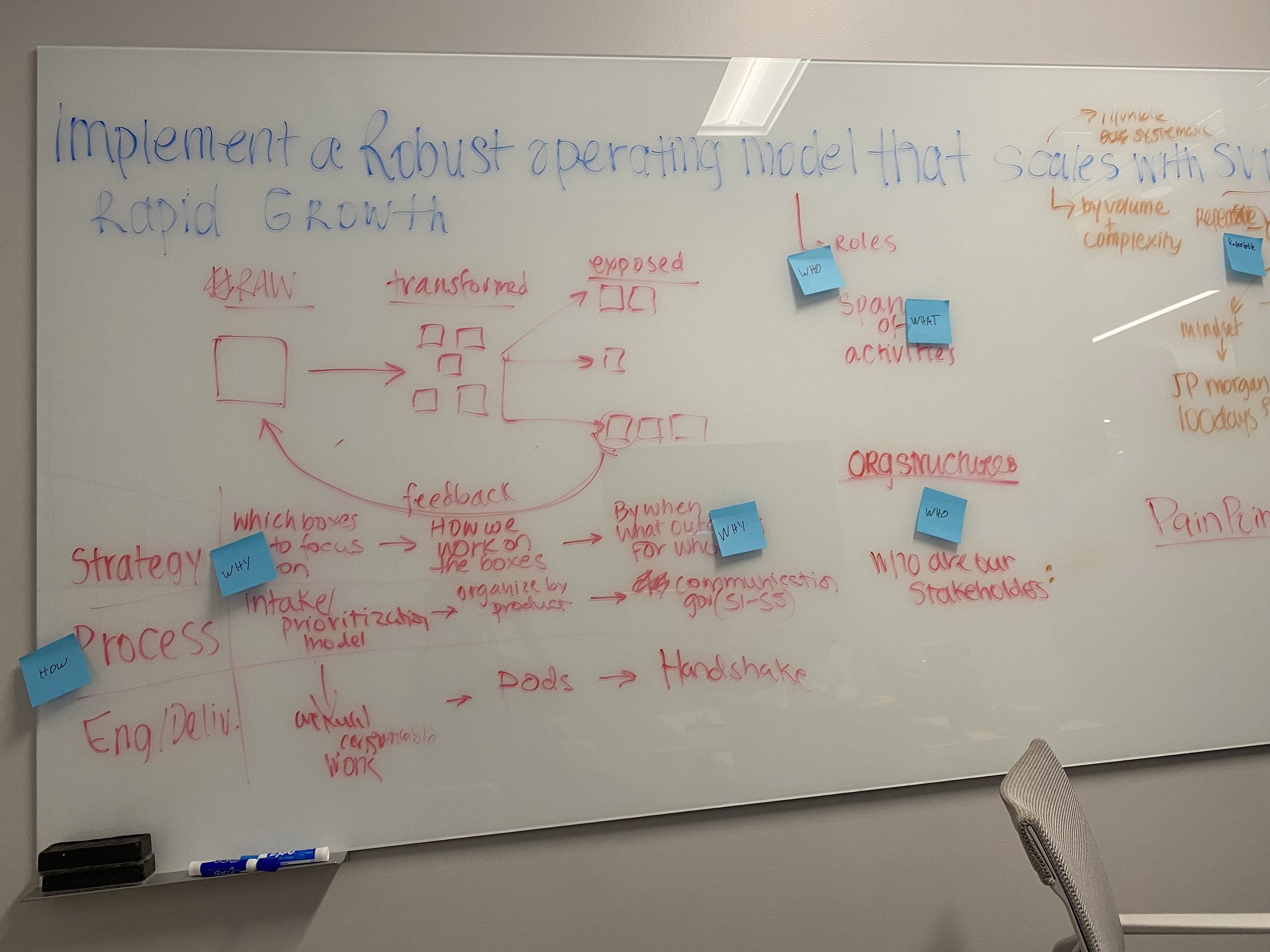
Individuals in breakout groups roleplayed different actors and touchpoints of different scenarios for each objective to uncover broken moments, challenge assumptions about how ideas may play out, and explore new possibilities for solutions.
Sales Pitch
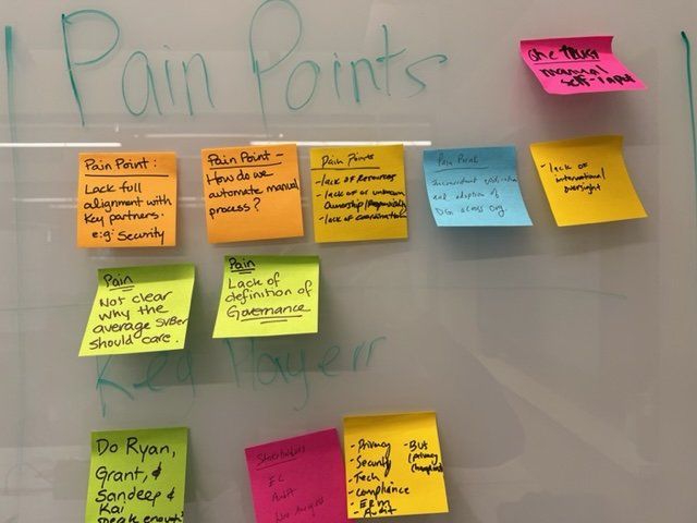
Breakout groups developed a sales pitch to sell the group's objective, using the learnings from the bodystorming activity, focusing on describing the ask, the problems associated with it, and how the solution can help.
Outcome
Participants left Workshop Part 1 having stepped out of their own role and exploring different perspectives on how data can help drive OKRs. They explored different ways of looking at each of the five key objectives, how to examine them in a different context, and how viewing problems in a different light can bring about novel solutions.
Part 2: Ideating and Visualizing the Dashboard
Objective
Part 2 continued to build on the progress made earlier in the day. This afternoon session was structured to leverage what everyone learned in the morning. It helped the SVB team identify what mattered most and visualize the future. The groups did this by learning how to do rapid sketching, then building and iterating based on new information and feedback.
Activities
No-Look Portrait
Participants were asked to sit in front of a partner and quickly sketch them, but without looking at their paper. This exercise helped participants warm up and be less self-conscious about the level of their artistic abilities.
Rapid Sketching
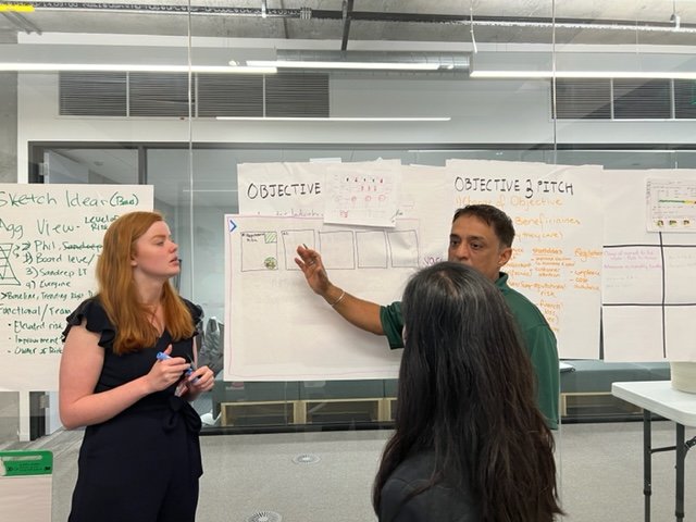
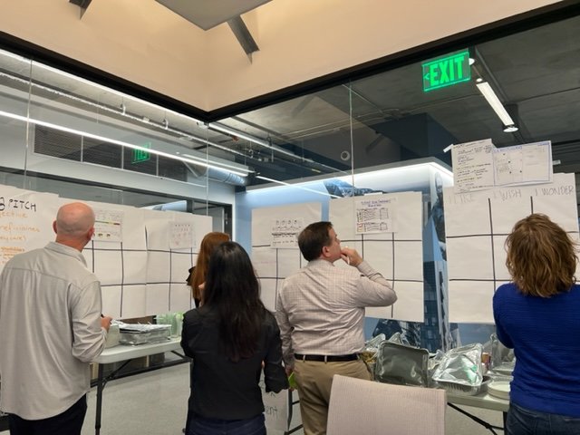
In their breakout groups, participants applied the same technique of sketching quickly and imprecisely to illustrate how a feature may be used to solve a problem identified during bodystorming.
I Like, I Wish, I Wonder
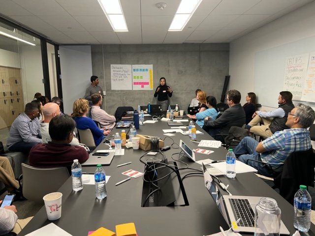
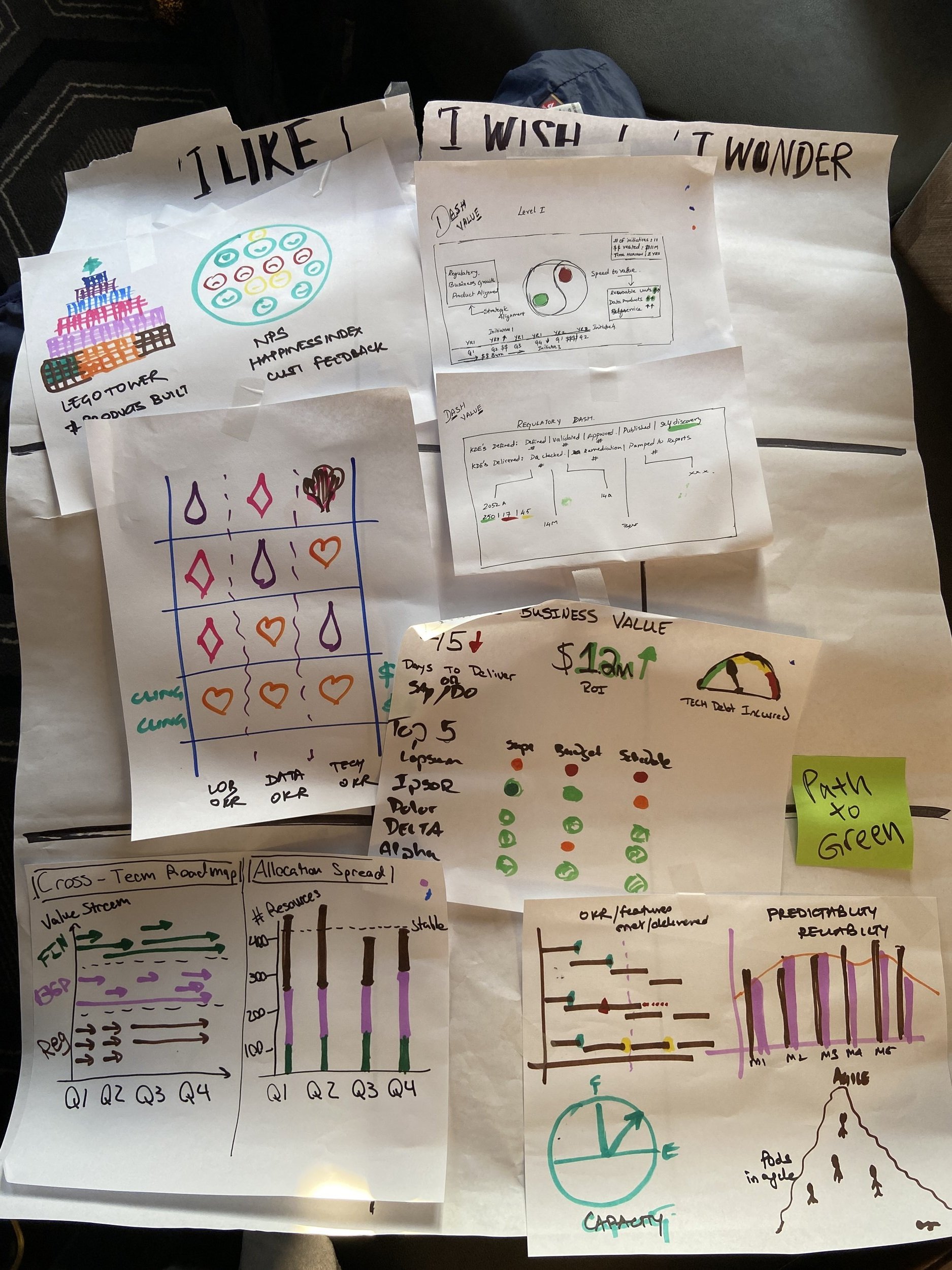
Once sketches of dashboard concepts were created, participants engaged in a review exercise, documenting what they like about the feature, what they wish were different, and how they wonder it could be.
Outcome
Part 2 concluded with a sketched concept for a dashboard created by each breakout group. The sketches illustrated solutions that address some of the challenges identified in bodystorming in Part 1. The team also was able to build on their sketches by examining what might work well, what might need to be improved, and considering developments in the future.
Part 3: Reflection and Next Steps
Objective
After two sessions of imagining a future-state solution, the last and final session led us to consider how this could come to life. Participants reflected on how the design activities were helpful in breaking down silos and bringing stakeholders with disparate objectives together to create a solution that works for everyone.
Activities
Presenting Mockup
Breakout groups presented the concepts for their dashboards that were created in Part 2. The final concepts were brought together into one mockup, incorporating new ideas that arose during design reviews.
Design Feedback
Participants were asked to reflect on their experiences throughout the design jam workshop, specifically considering how the experience was valuable and how it could help them solve problems.
Outcome
Participants identified the opportunities for future work and benefits of bringing stakeholders together in the same room. They experienced how collaborative design and rapid prototyping can create a concept for a solution that can be built to address the needs of many.
The Dashboard
Bringing the ideas together
Based on the concepts, ideas, and needs that were gathered from Day 1 of the workshop, the team delivered a dashboard design that would help the EDAP team communicate effectively. Check out the iterations below, starting with the sketches that participants came up with during the Design Jam.
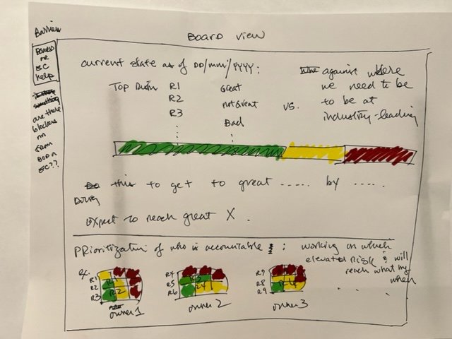
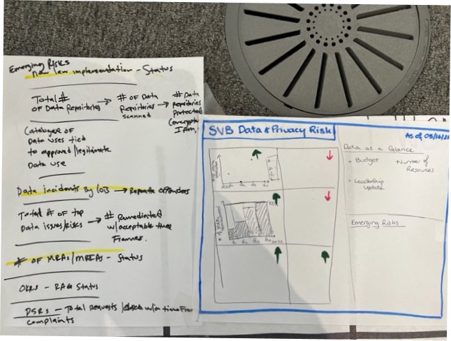
Sketches: Visualizing and understanding valuable data
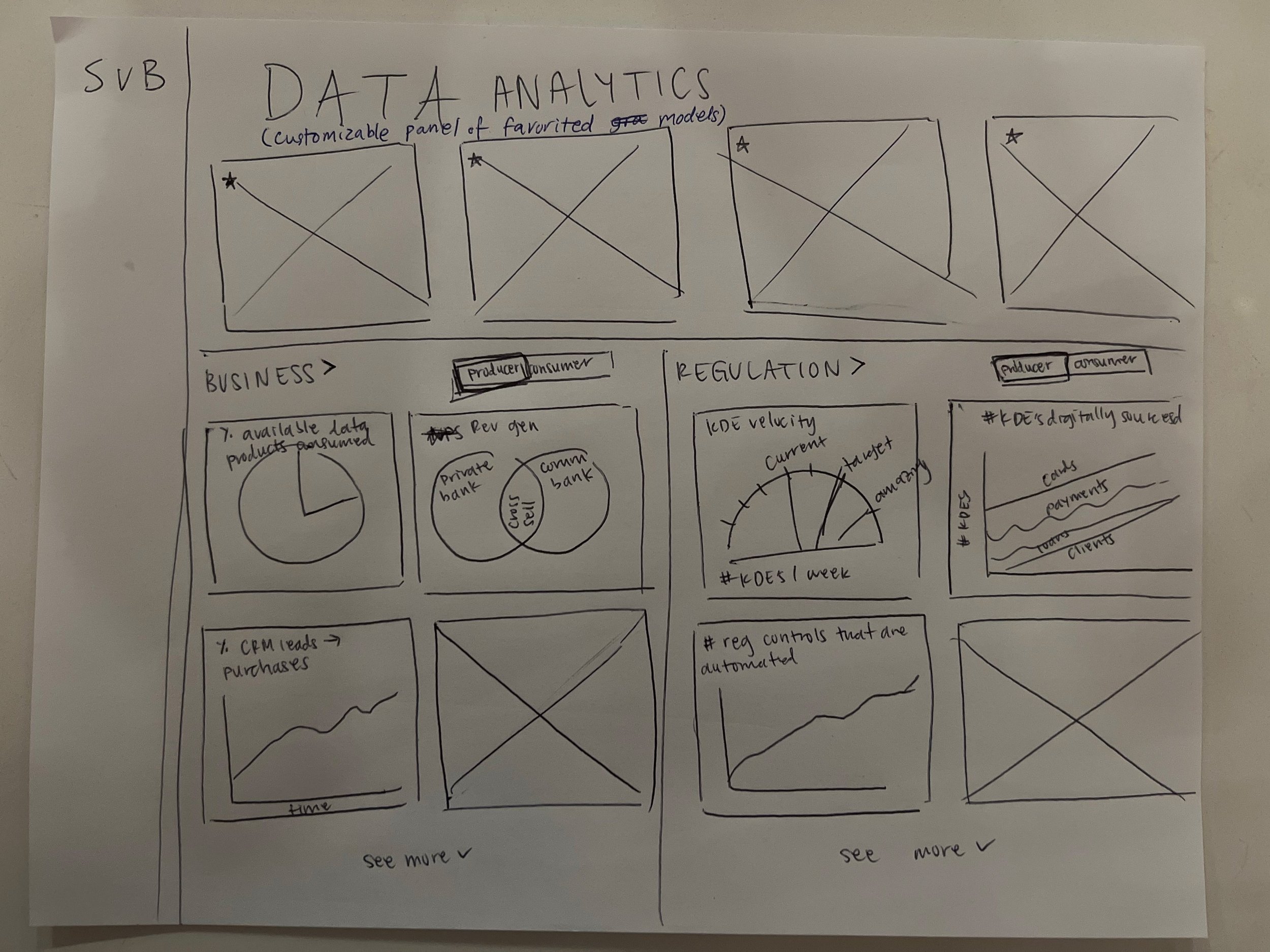
During the workshop, participants were asked to create sketches of what the dashboard could look like for each of the five key objectives. This allowed us to understand what types of data and visualization would be most relevant for data executives to look at, from the perspective of the EDAP team.
Low-fidelity Design: How can we show data impactfully?
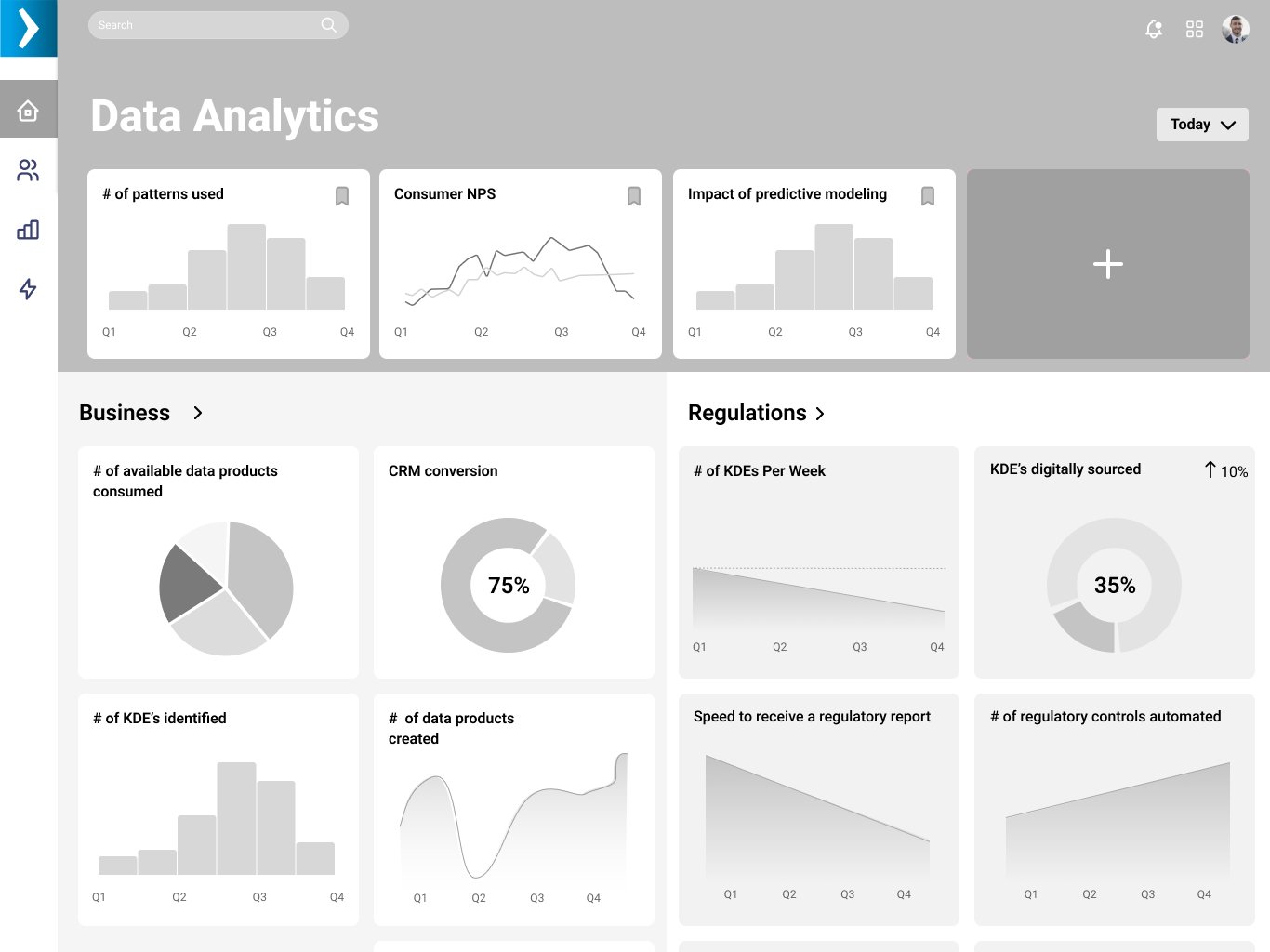
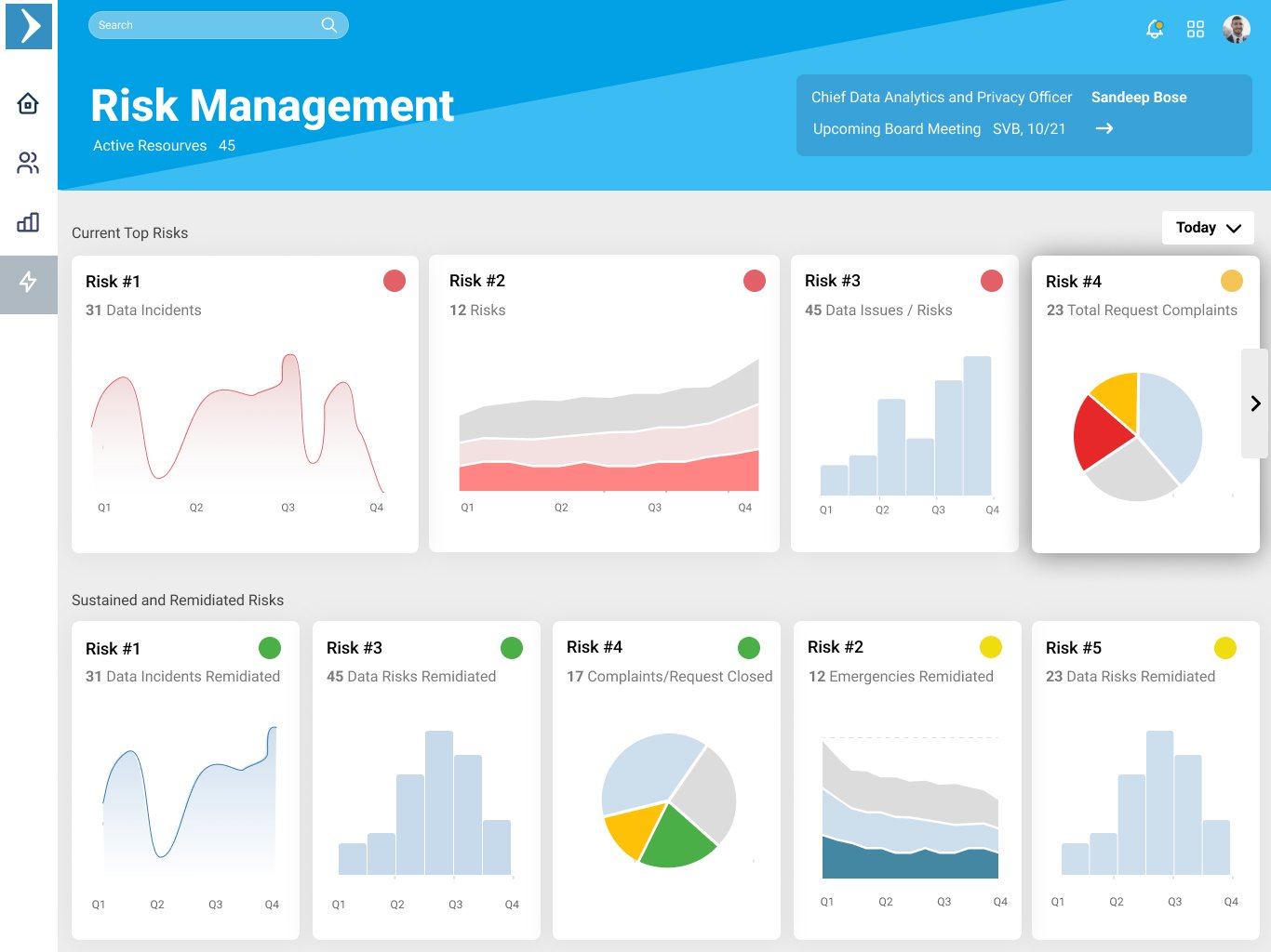
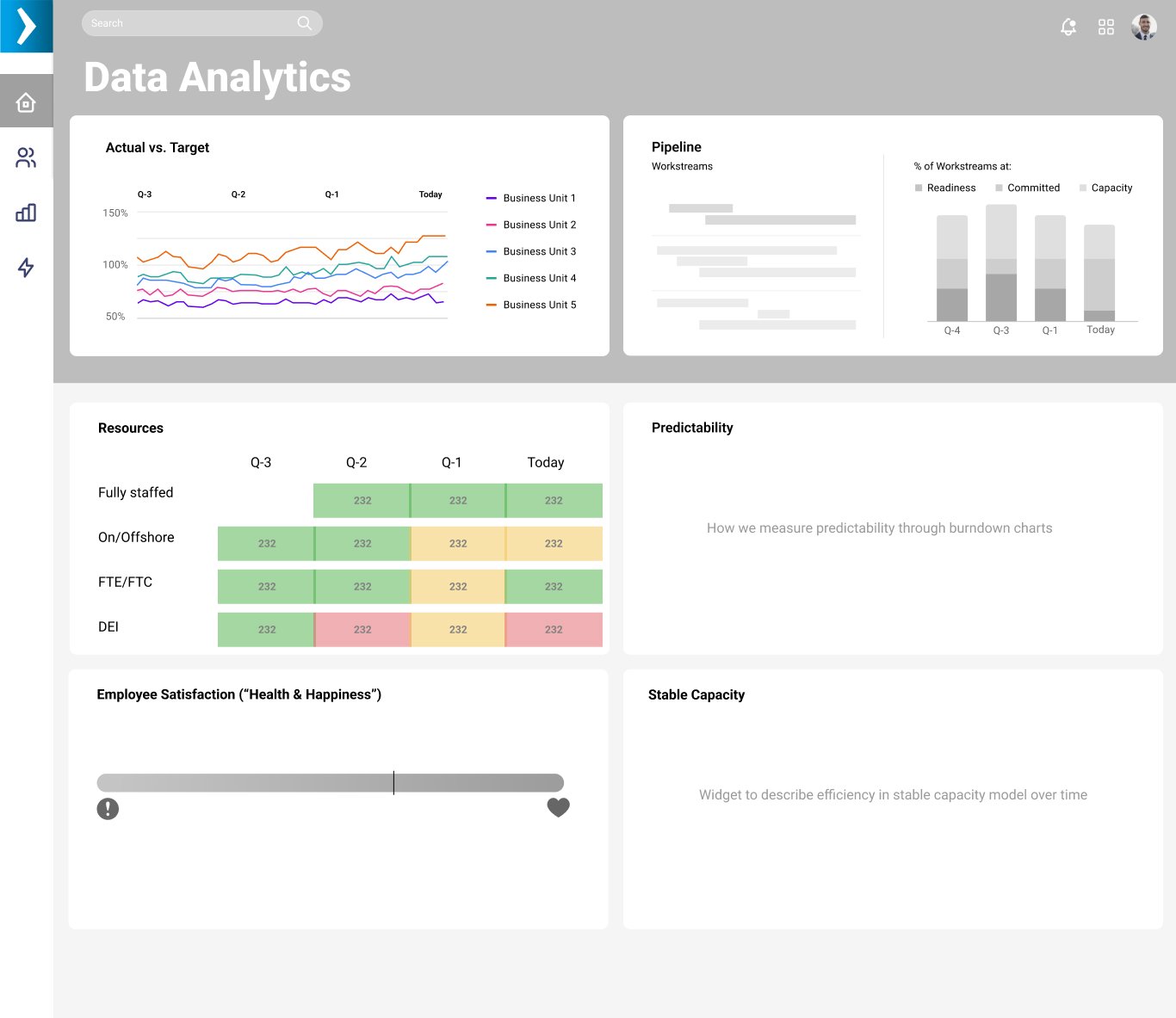
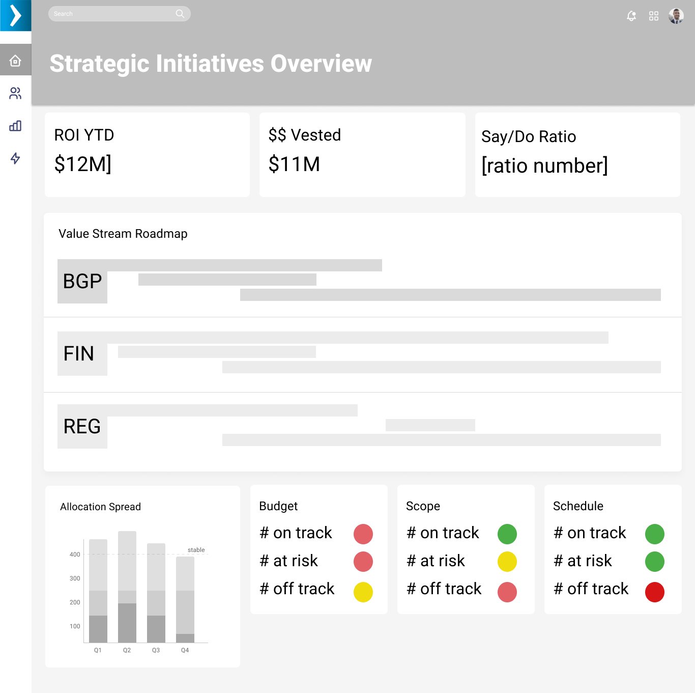
Based on the sketches from the workshop, the design team created low-fidelity designs of the dashboard that would allow the user to get both a high-level view of the data and focus on data specifics when needed. We wanted data executives to be able to understand the state of the company at a quick glance, customize the view as needed, and easily tell a story through the information presented.
Final Iteration: Action items and prioritization
We received feedback that data aligning to the five objectives didn't necessarily need to live on separate screens. We also heard that it was important to incorporate actionable items, module customization, and risk prioritization. This would allow the user to easily understand and take action on the most important items within the data practice.
View the Figma prototype ↗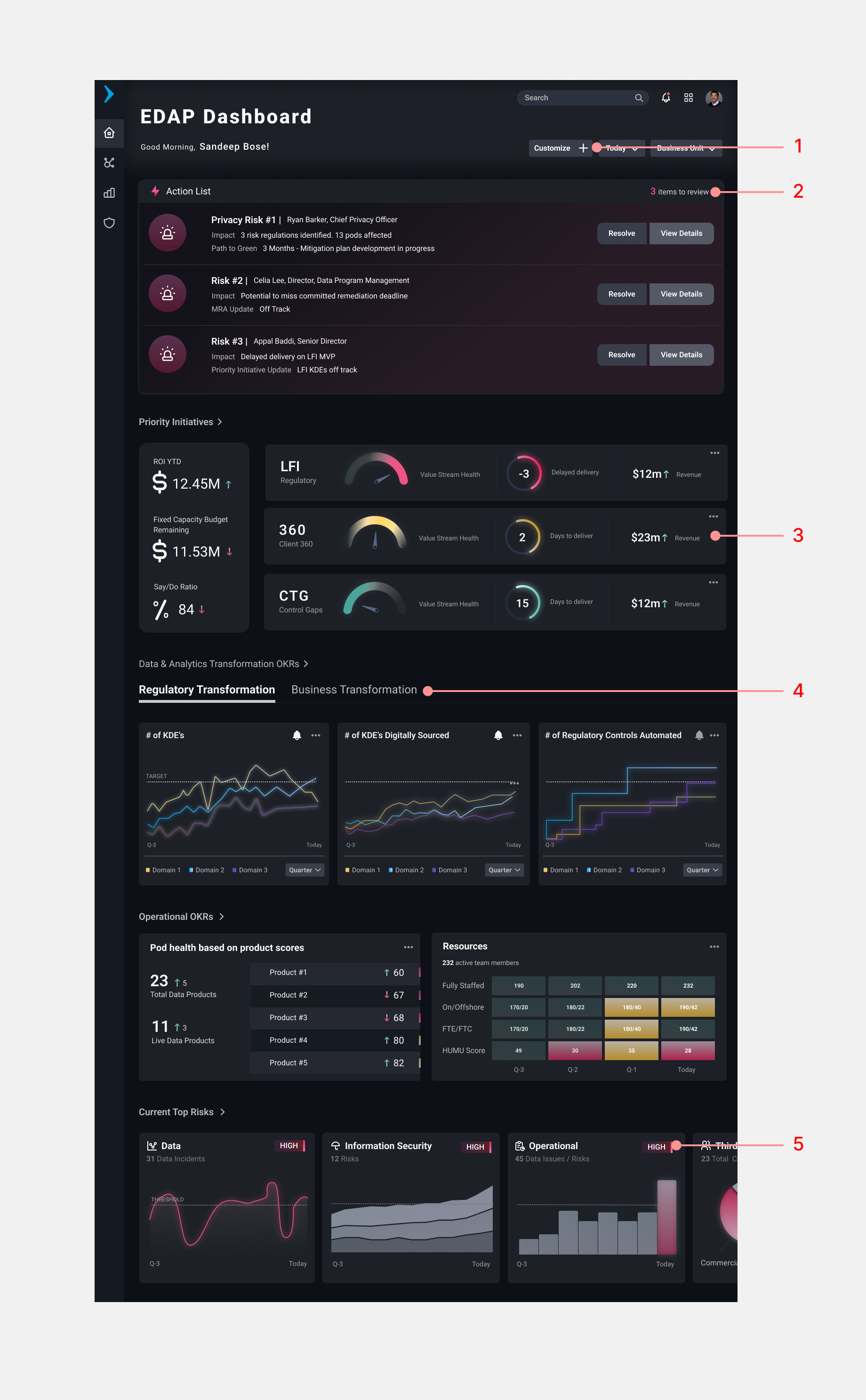
Module Customization. Users can personalize their dashboard to view what matters most to them.
Actionable Modules. Users can turn on notifications for modules, bookmark/hide/flag them, and more.
Data Visualization. Modern data visualizations like heatmaps, interactive charts, health meters and more help the user make sense of complex data.
Tablet Scrolling & Tabbed Views. Users can swipe left and right to view more modules within a section.
Priority Tags. Clear module tags identify risk levels.
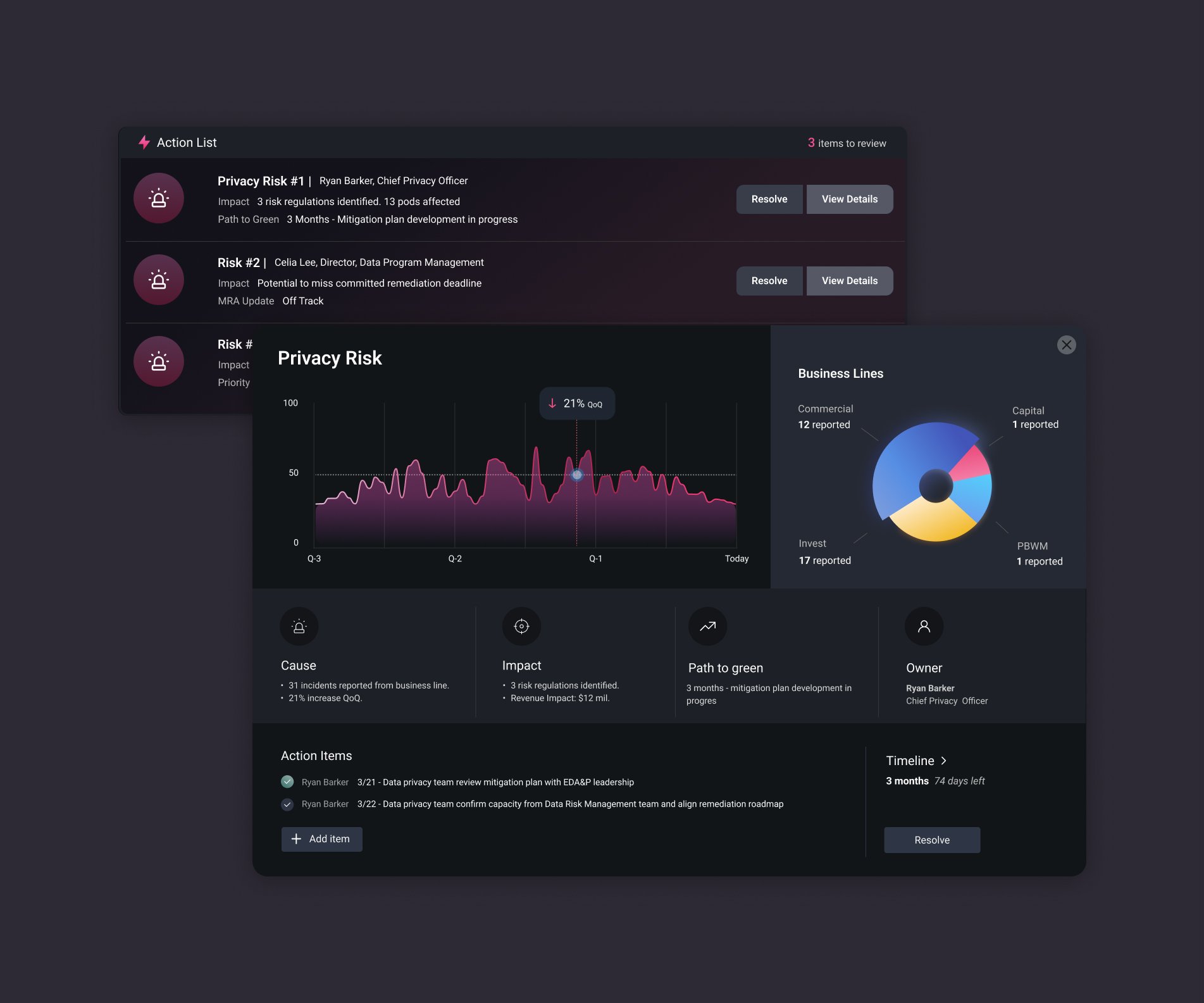
Health Check Daily Action List
We heard that the client wanted to know what to take action on easily through the dashboard. We created an Action List feature on the dashboard to provide the user with clear details on current threats and risks to the health of the data team.