
Responsive Web Design · Solo Project
Simplifying the insurance shopping process
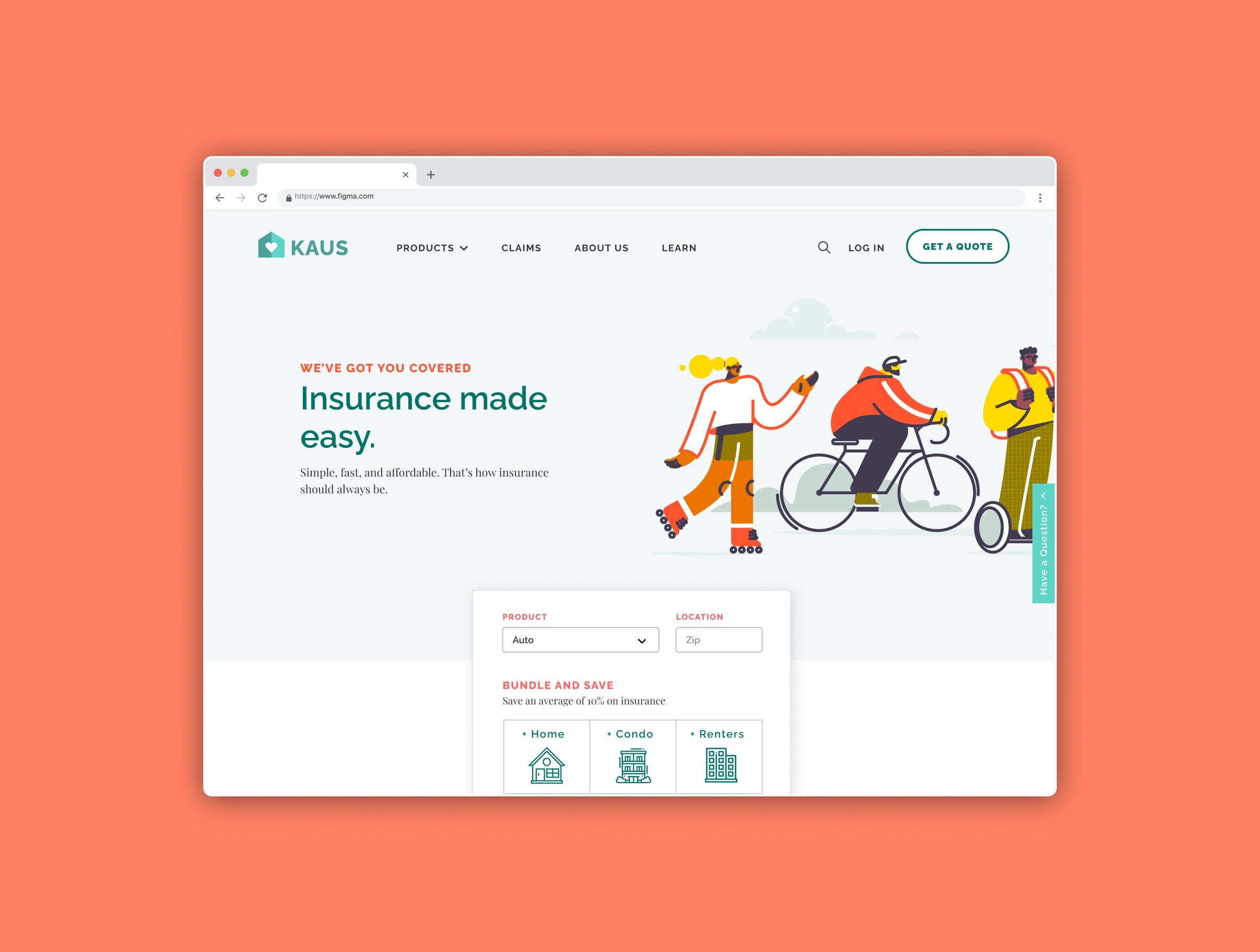
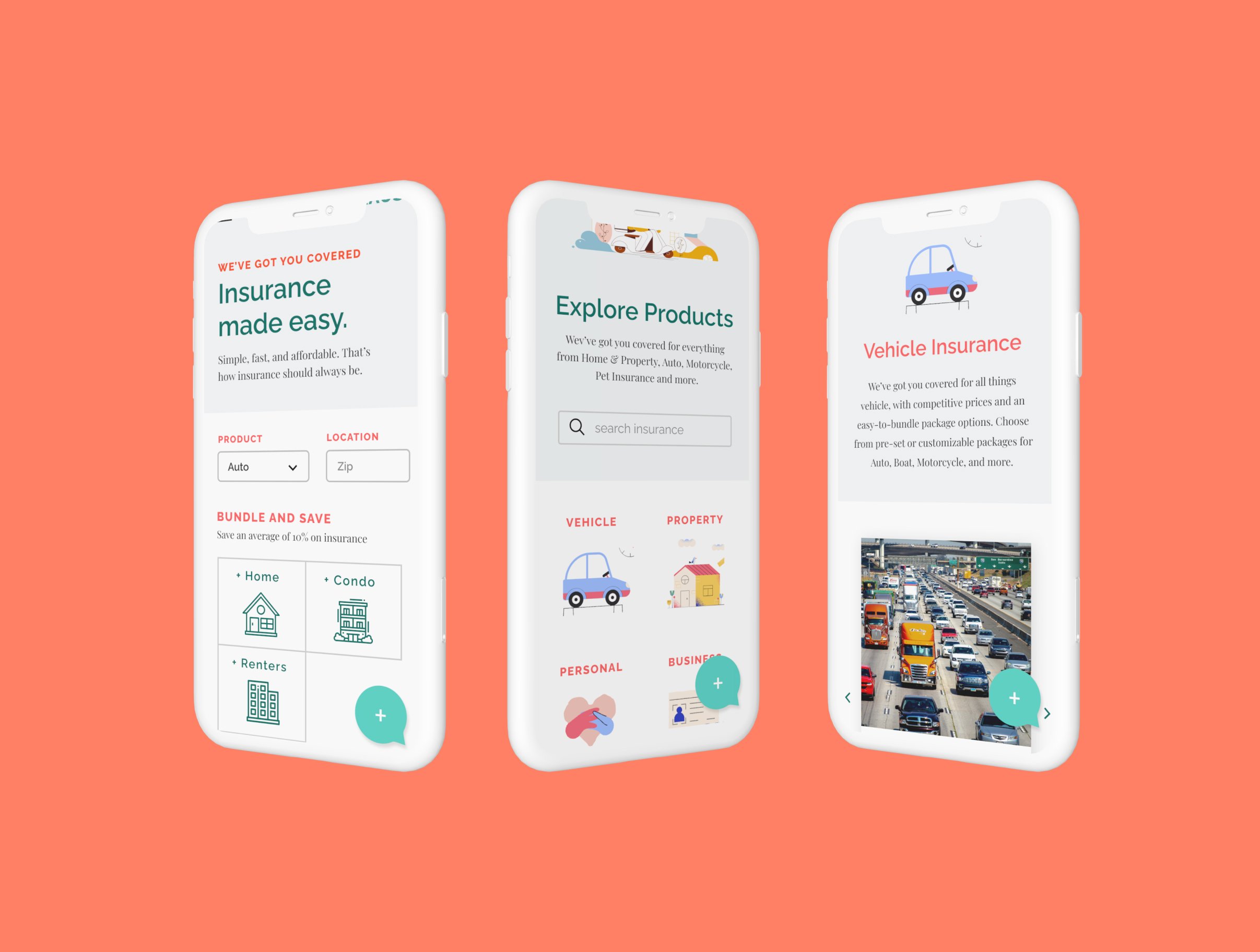
The goal of this project was to design an e-commerce insurance website for a conceptual insurance provider called Kaus. This included creating a seamless user experience for new and seasoned insurance buyers, from browsing packages and understanding their unique coverage needs, to purchasing. The website would allow customers to avoid the typical frustrations that often discourage them from buying insurance.
Overview
Making insurance feel less intimidating
Shopping for insurance is not easy. After choosing among numerous providers, customers are often intimidated by the lengthy and confusing process of sifting among packages to find one that will suit their unique coverage needs for the best price. Insurance has been largely digitized and can be purchased online without an agent from most major providers. However, tech-savvy consumers who are used to expedited online processes are often met with a less-than-pleasant experience when purchasing insurance online.
Design challenge
How might we create a more pleasant experience for customers who are looking to purchase insurance online?
Research
Understanding what shoppers need
Research provided insight into the motivations and expectations of various insurance shoppers, as well as the complexities of insurance itself. This informed design decisions that took both customer and business needs into account.
Market & Competitor Research
The goal was to understand the current state of the insurance industry, general customer sentiment, and the digital capabilities that competitors offer. Here were the key takeaways:
User Surveys & Interviews
Four interviews and 11 surveys were conducted with participants of varying ages, genders, and level of experience with insurance. This helped verify insights about customers from market/competitor research and uncover more nuanced findings.
Customers tend to be focused on price and appreciate simplicity
The most important factors when choosing a provider tend to be price, coverage quantity, and ease of use.
Information on current insurance sites can be better organized
Most sites allow purchasing without an agent, but fall short on navigation, ease of use, and overall experience.
Experience design, personalization, and modernization are a must
A large shift toward InsurTech and data analytics is driving modernization and personalization of the customer experience.
Most people don't want to talk to an insurance agent.
At what point in your search might you reach out to an insurance agent?
100% of respondents felt it would be helpful to have a risk assessment calculator.
90% of respondents were concerned with having too many package options.
Respondents express varying levels of confidence in understanding their own coverage needs.
Customers primarily care about price and brand.
What is the most important factor to you when considering insurance?
Most individuals choose insurance providers through word of mouth or referral (45.5%), followed by independent online research (27.3%).
All respondents reported feeling confused or intimidated by insurance jargon and terminology.
Individuals tend to prefer being able to choose from both preset and customizable insurance packages.
User Persona
Insights from user surveys and interviews helped inform the persona, Justin:

Justin
Associate Consultant
"I'm always super busy with work or friends and I don't have a lot of time to spend searching for insurance. I want something reliable and affordable, and I want to get it done fast."
Justin is currently searching for an auto insurance plan. He has had experience shopping for renter's insurance in the past, which was relatively simpler. Although he makes a decent salary, he would prefer not to spend too much on insurance early on in his career. He is tech-savvy and values simplicity, and would like an easy and straightforward shopping process.
Goals/Needs
- Affordable insurance
- Quick and straightforward shopping process
- Reliable brand & sufficient coverage
Frustrations/Fears
- Insurance jargon and confusing terms
- Not getting a good deal
- Long, complicated process of purchasing insurance
Information Architecture
Since the primary goal was to create a simple and easy insurance buying process, it was important to ensure that the website would be easy to navigate.
Two open card sorts were conducted using Optimal Workshop to understand how users categorized (1) pages on the site and (2) insurance products. Card sort results from 7 participants informed a site map that would be intuitive for users navigating insurance products or sections on the site.
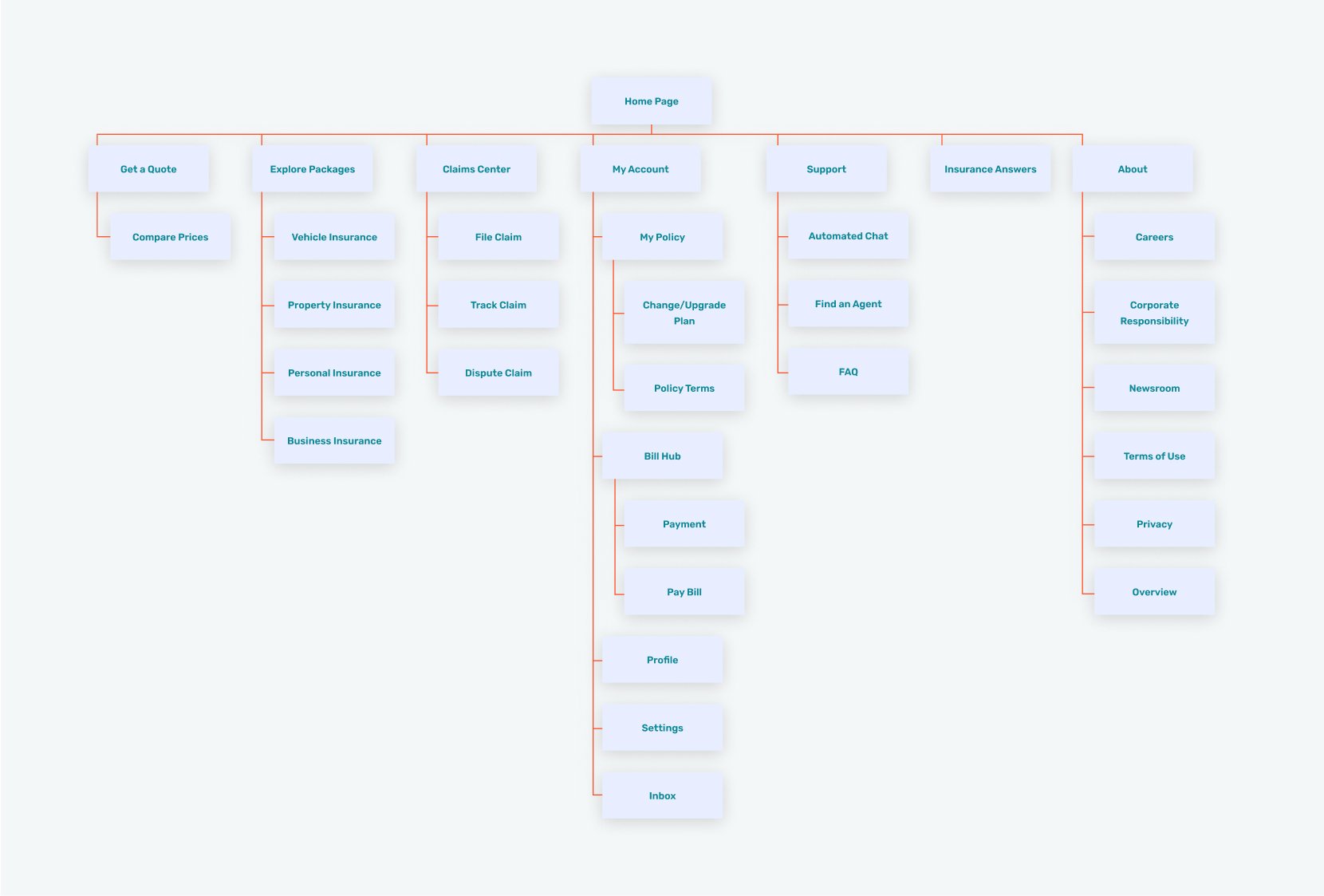
Site map was informed by card sorting results.
User Flow & Task Flows
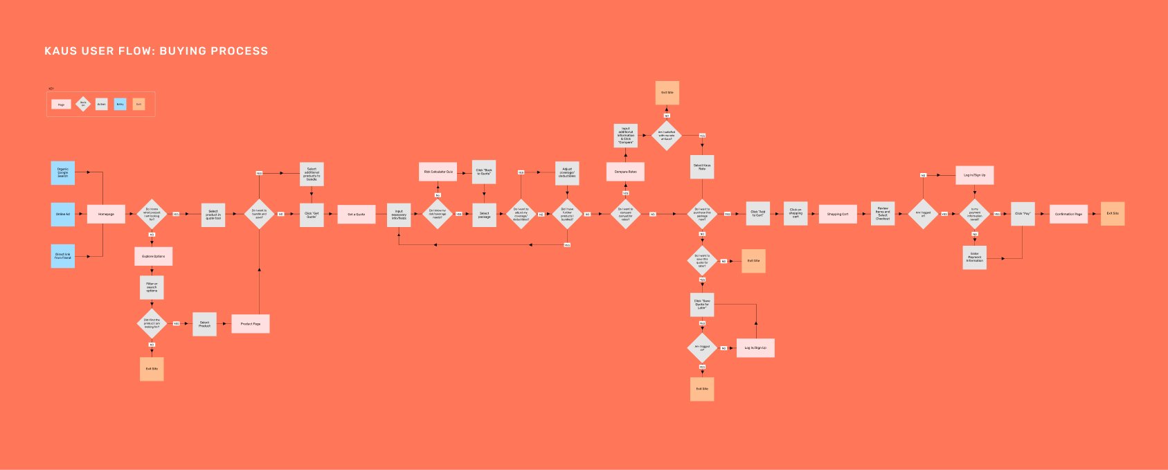
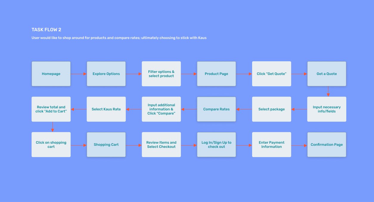
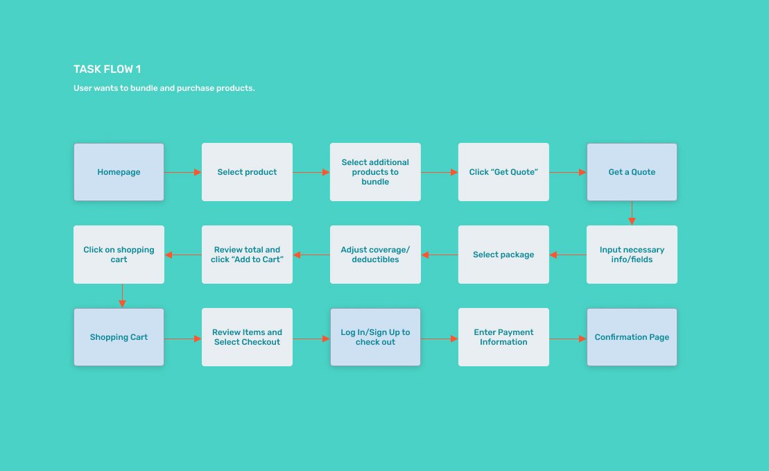
The site map helped inform the user flow, which mapped various paths a user could take on the site. Two task flows focused on the two prioritized tasks that users might take when purchasing a product.
Wireframes
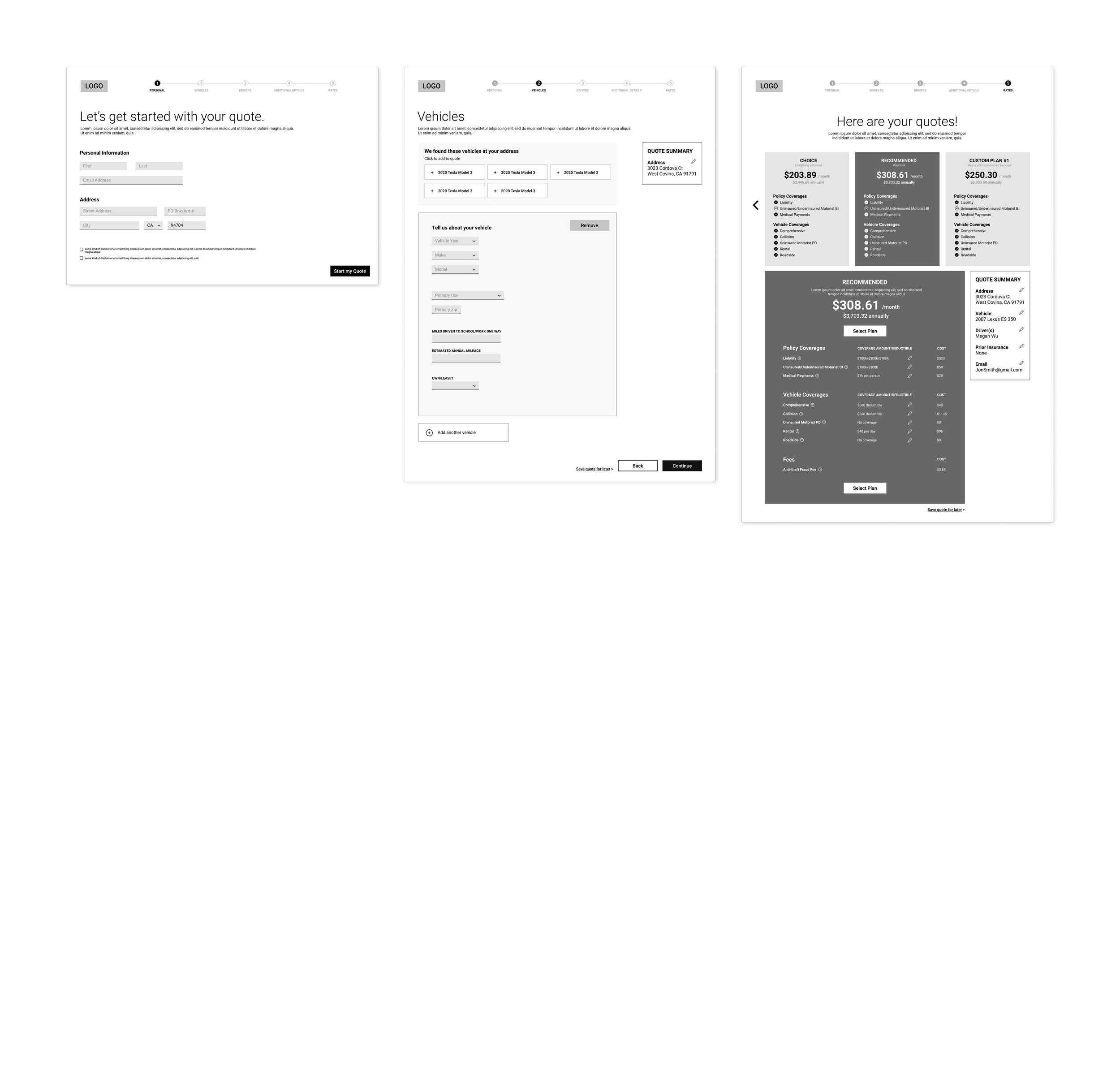
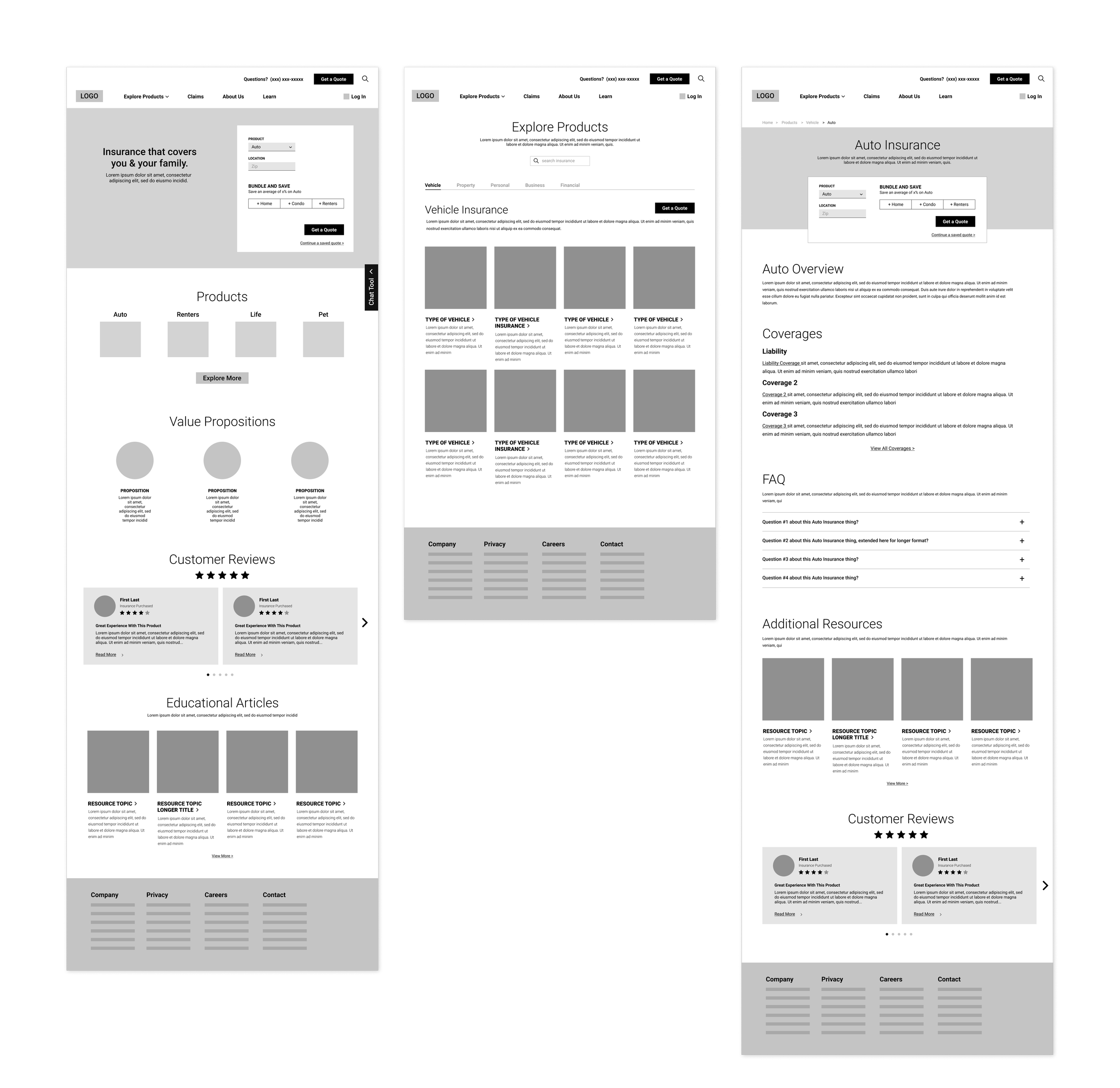
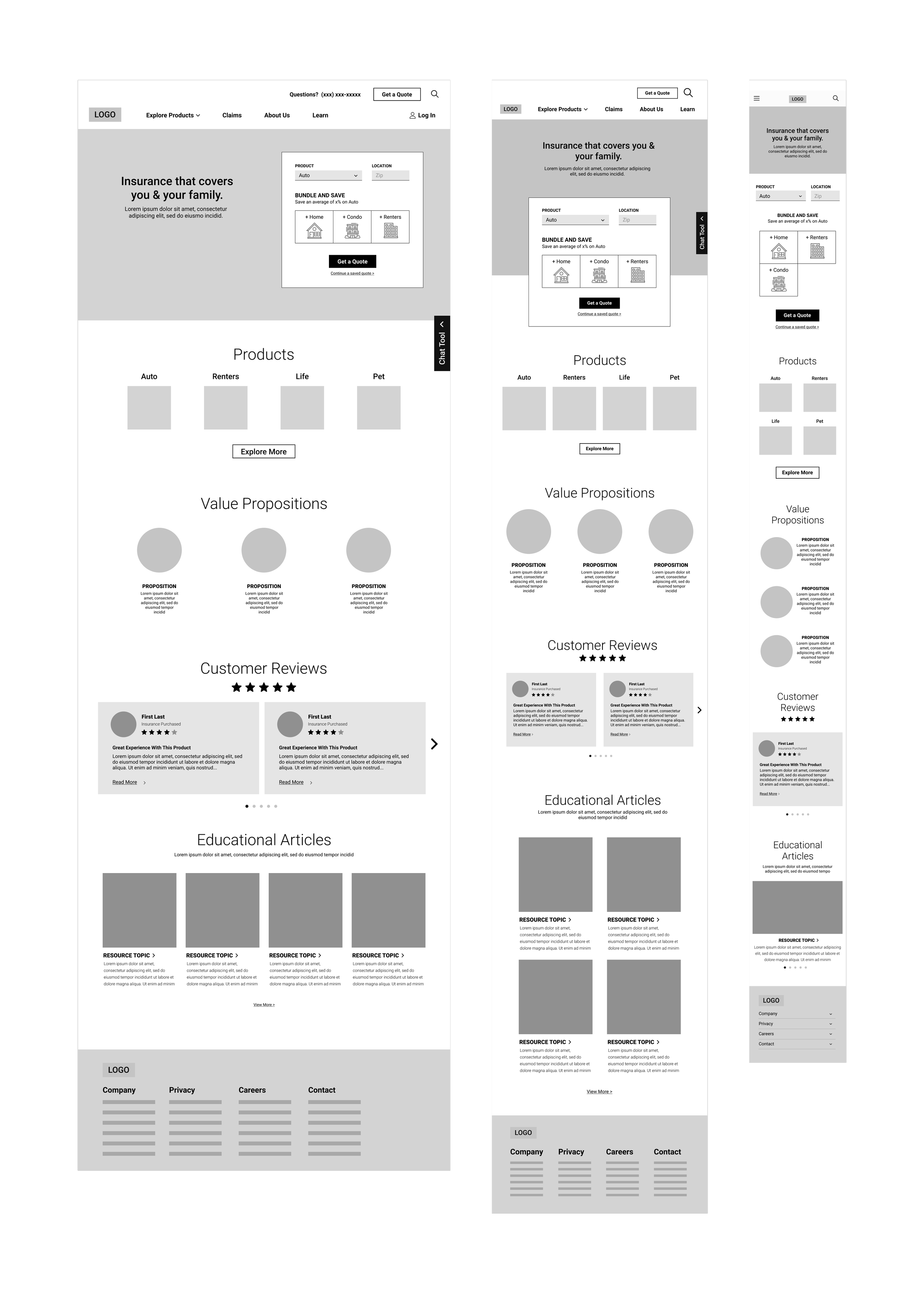
Mid-fidelity responsive wireframes were designed for the two task flows.
Branding
Modern and approachable
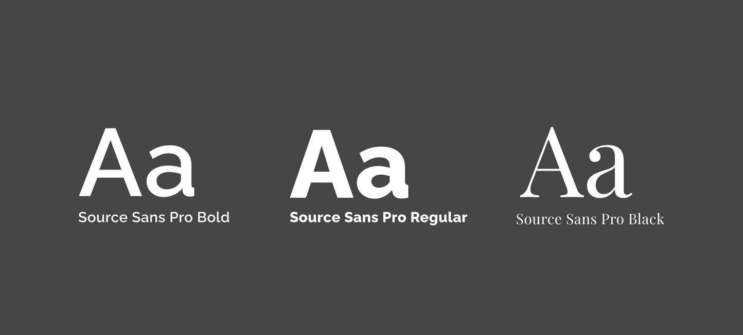
It was important to create a brand that felt modern, fresh, and approachable. This presentation would play a part in easing customers' reservations about the typically intimidating insurance purchasing process. It could also help appeal to a younger, tech-savvy generation that often expects companies to have a well-developed and welcoming brand.

Design
Homepage as a Hub
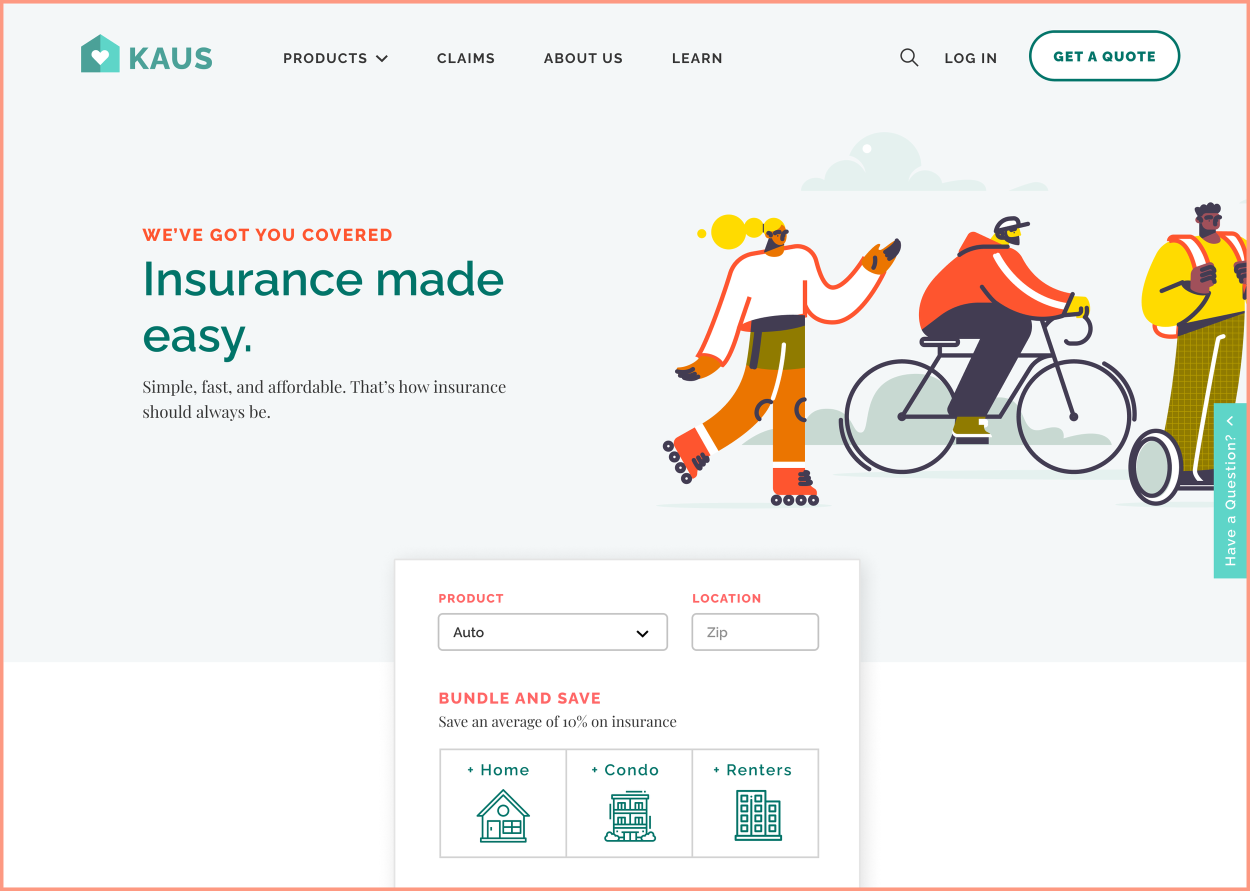
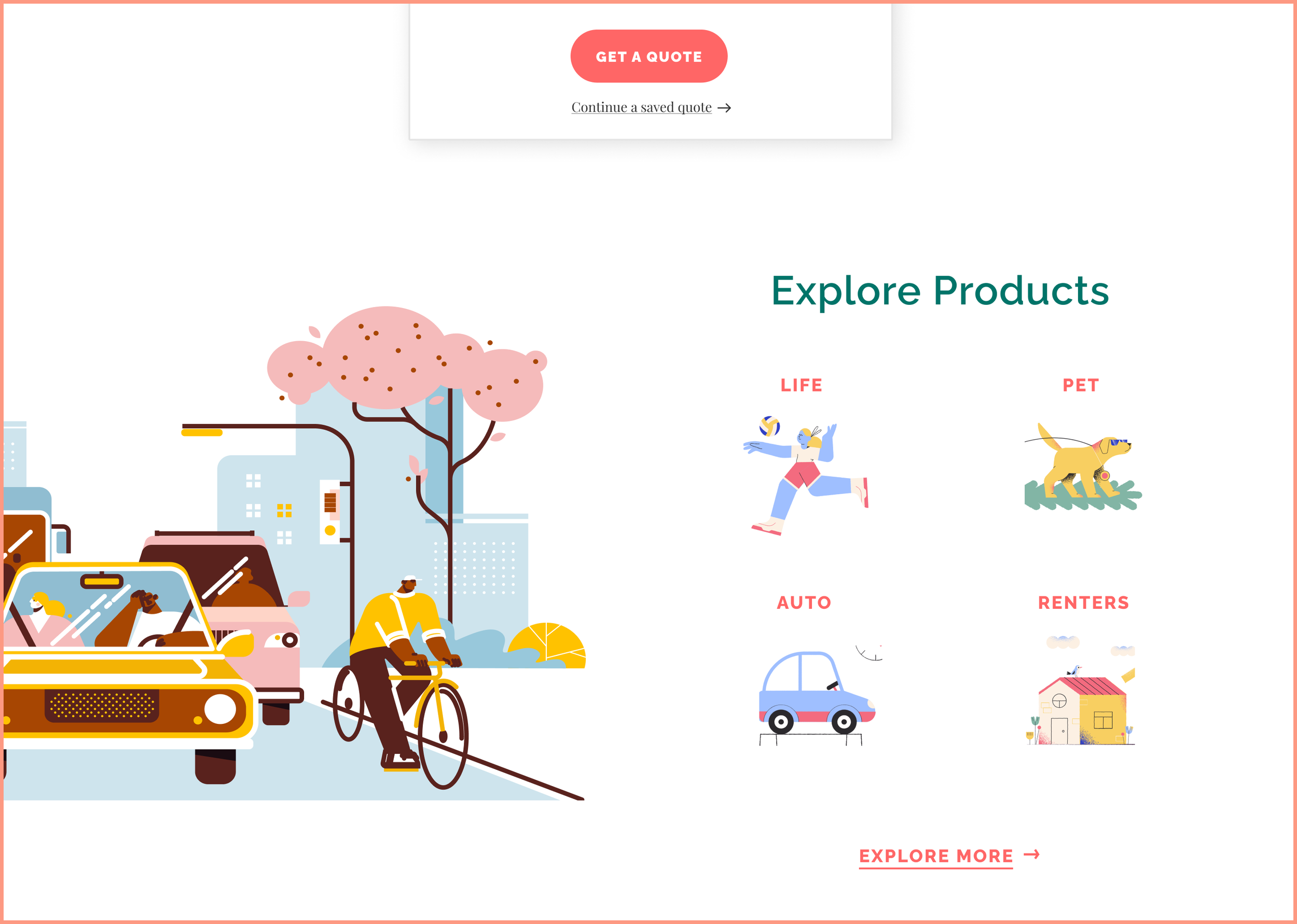
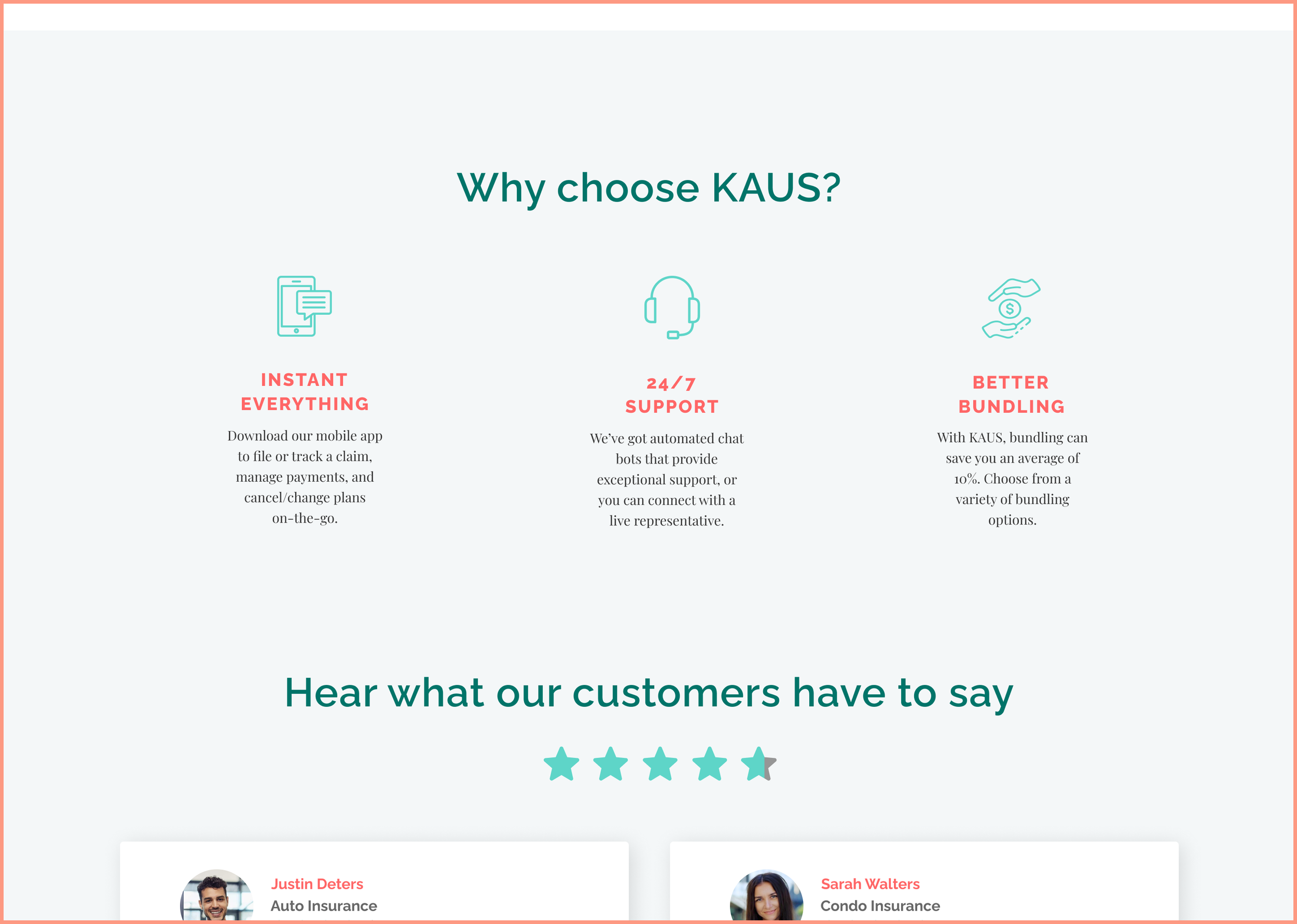
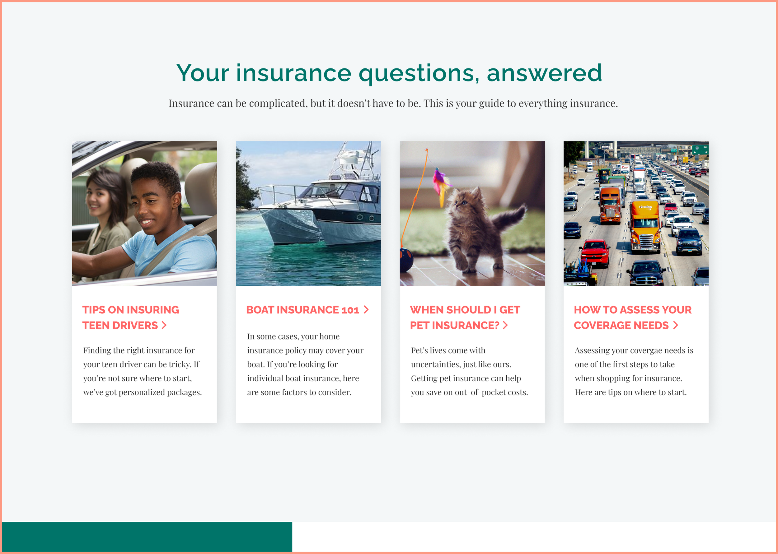
It was important that the homepage accomplished two main things: (1) Develop brand trust and (2) serve as a hub that encourages users to explore products or get a quote. This was achieved through brand messaging and strategic placement of CTA's.
Finding and understanding products easily
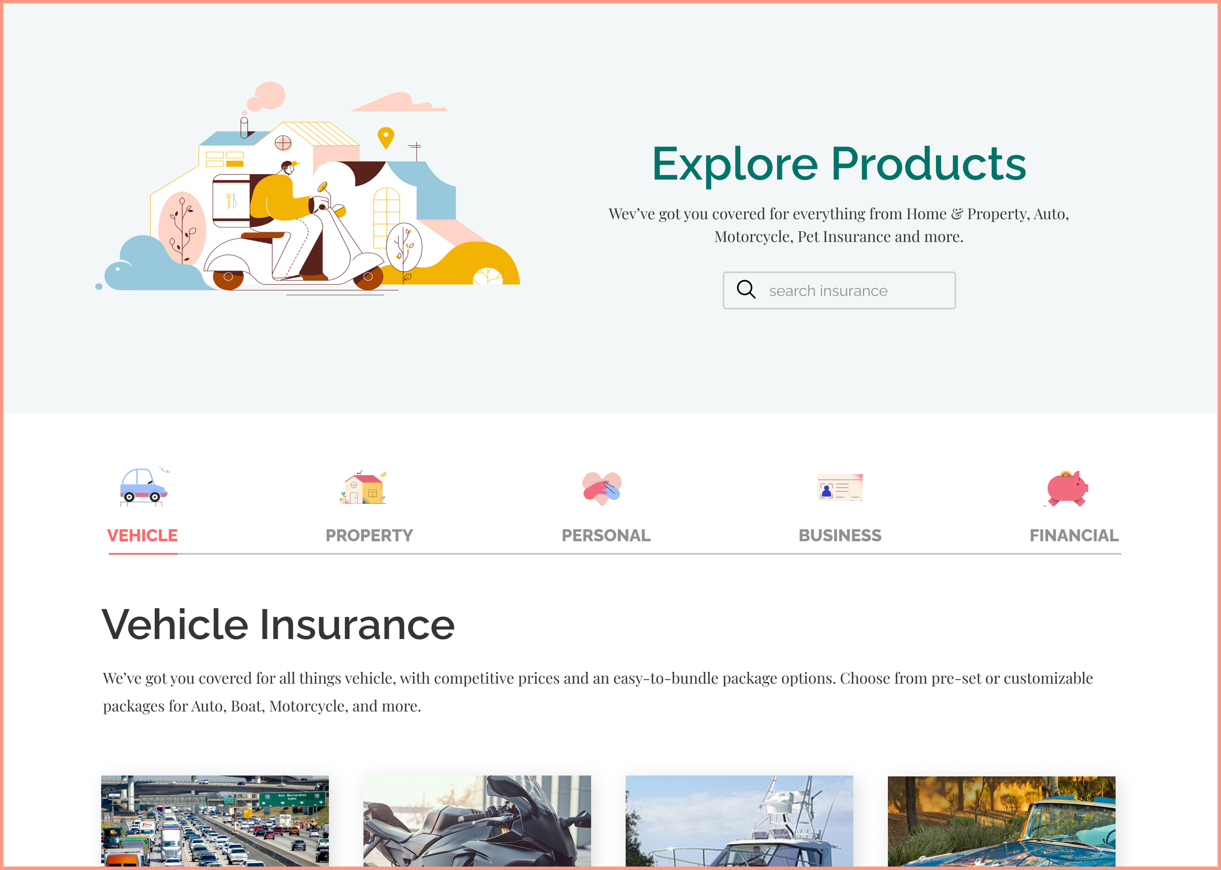
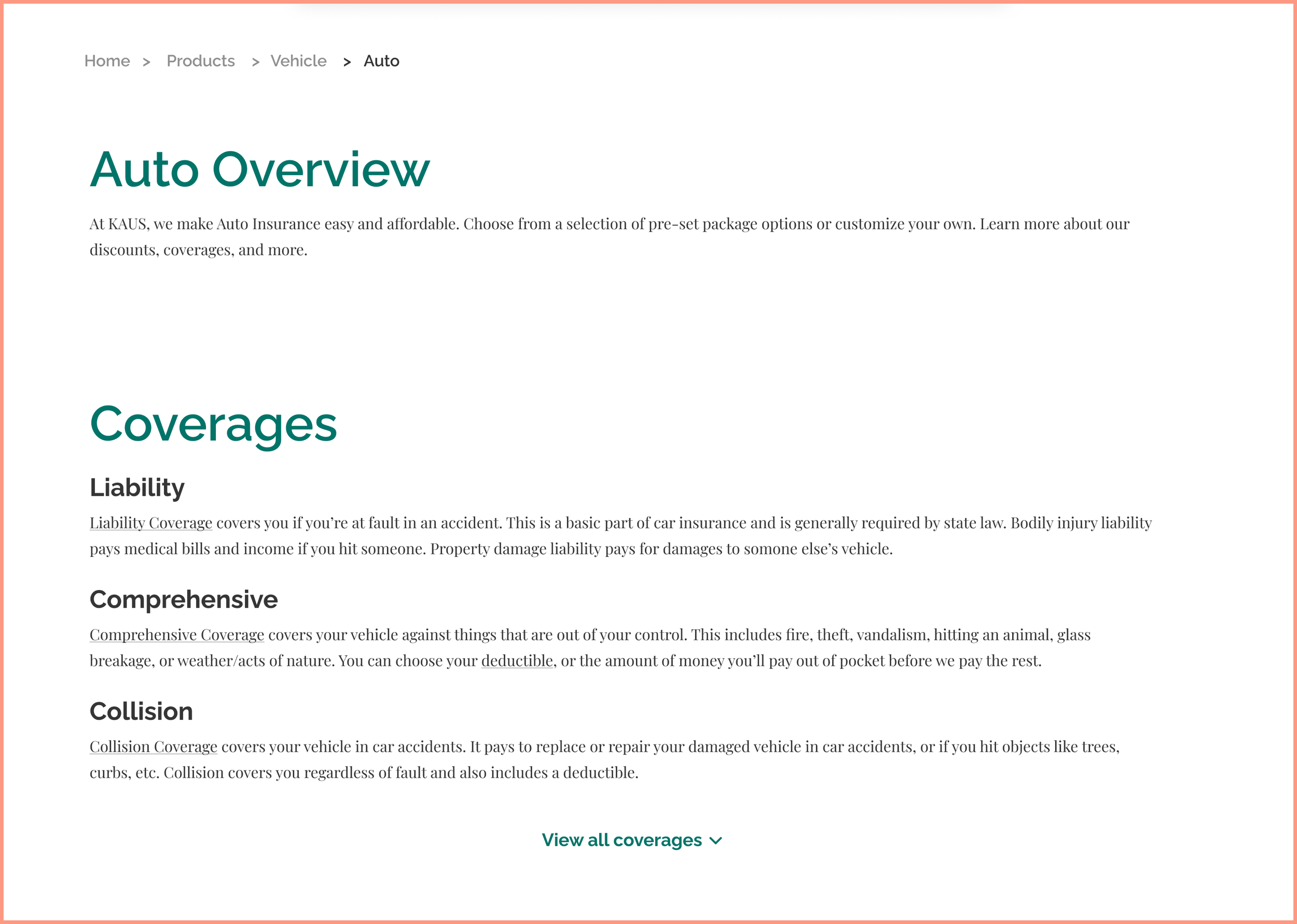
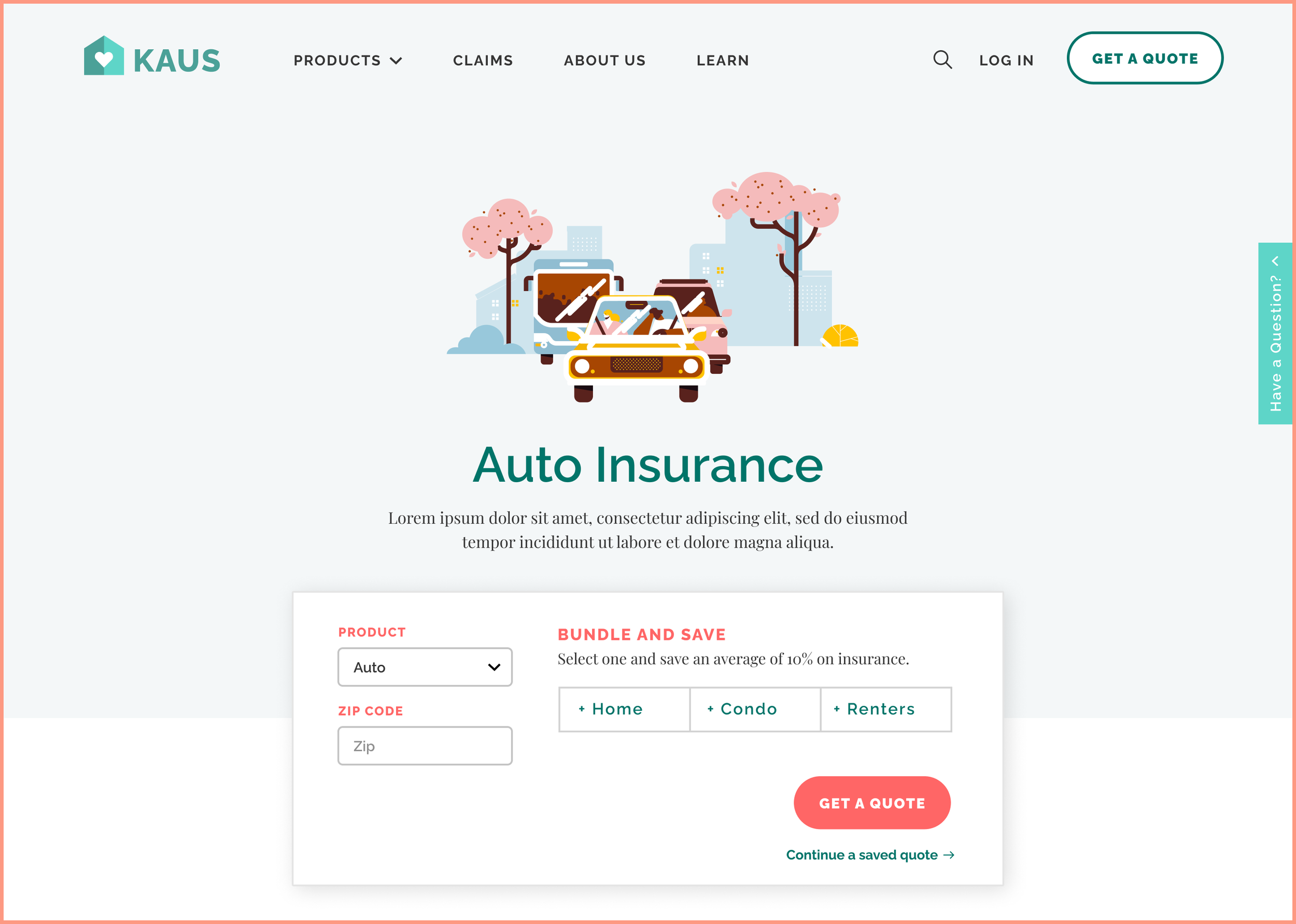
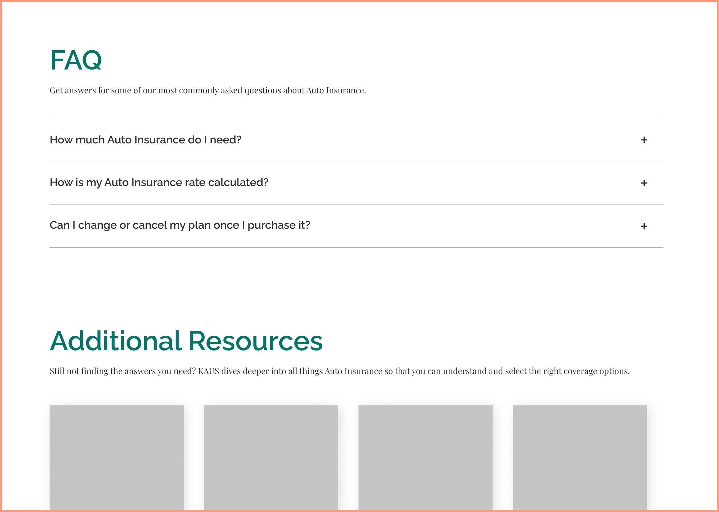
One of the main concerns of insurance shoppers was the complexity of the insurance shopping process, which begins with finding the right product. Through the Explore Products page, customers can easily browse various insurance products by type. Additionally, the product page was designed to be digestible and easy to understand. It avoided insurance jargon and included resources and FAQ's for each product.
Efficient quote estimation
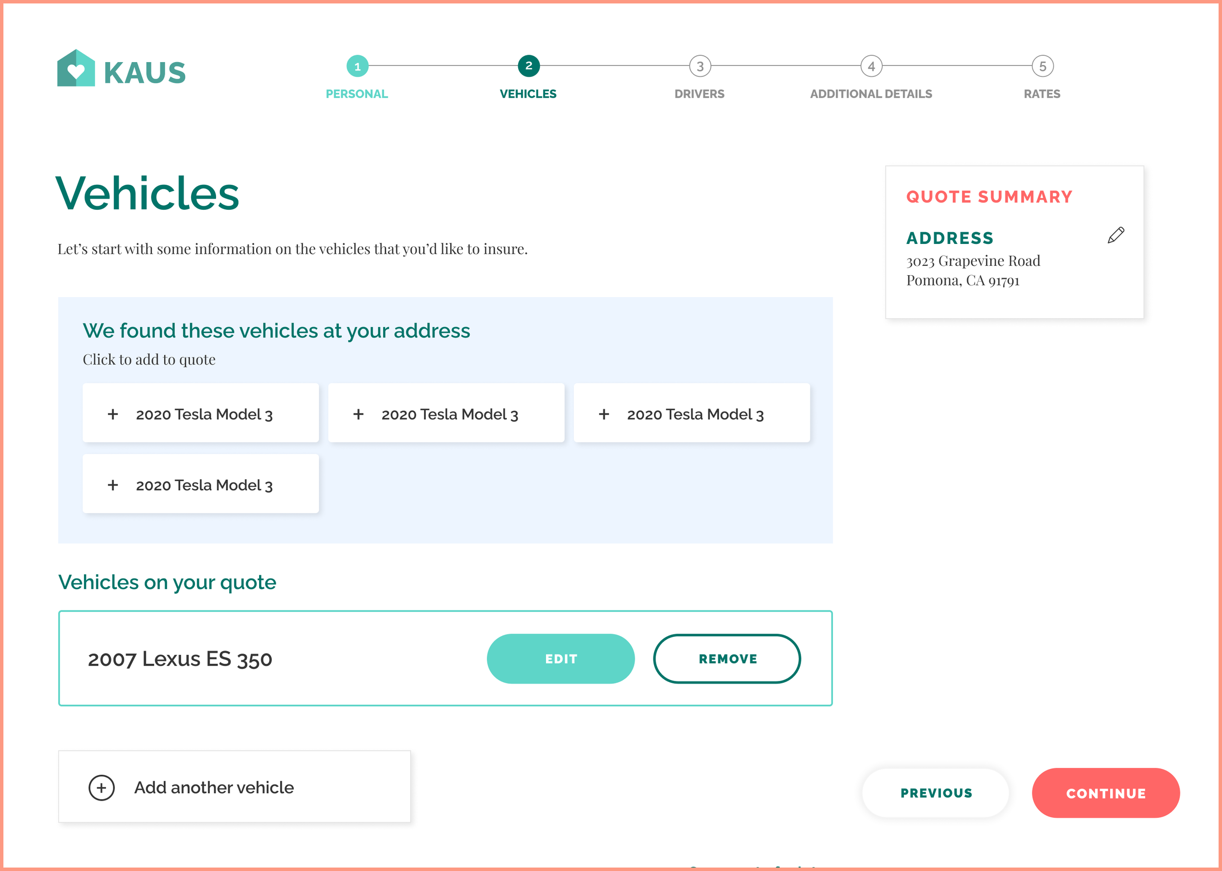
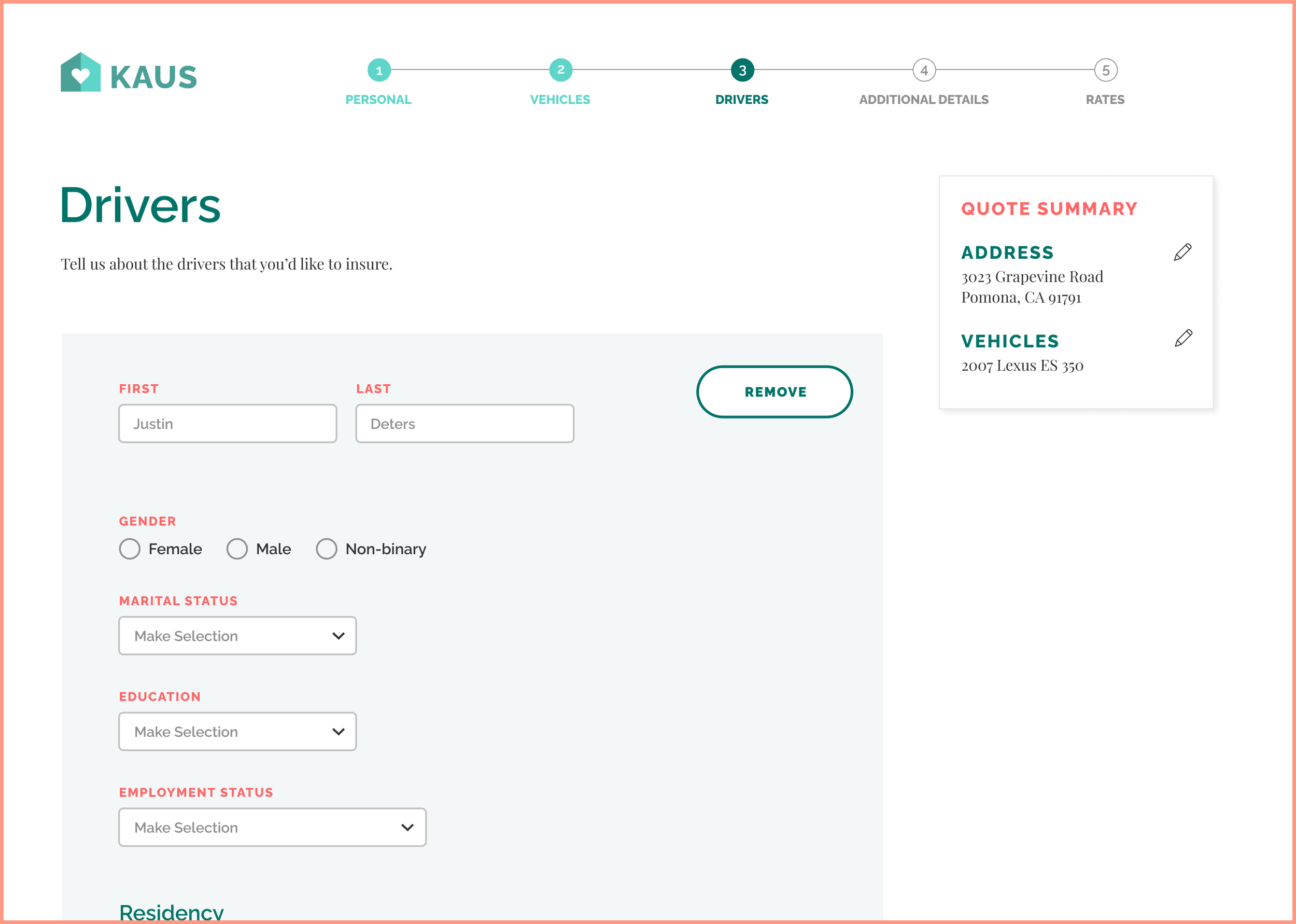
100% of survey respondents said that a quote estimator would be an indispensable tool. When considering that the majority of people didn't want to talk to an insurance agent, it was even more important to make the entire shopping experience an easy, self-serve process. The quote process would pre-fill as much information as possible and ask only the necessary questions, thus minimizing the risk of overwhelming the user.
Limiting decision fatigue
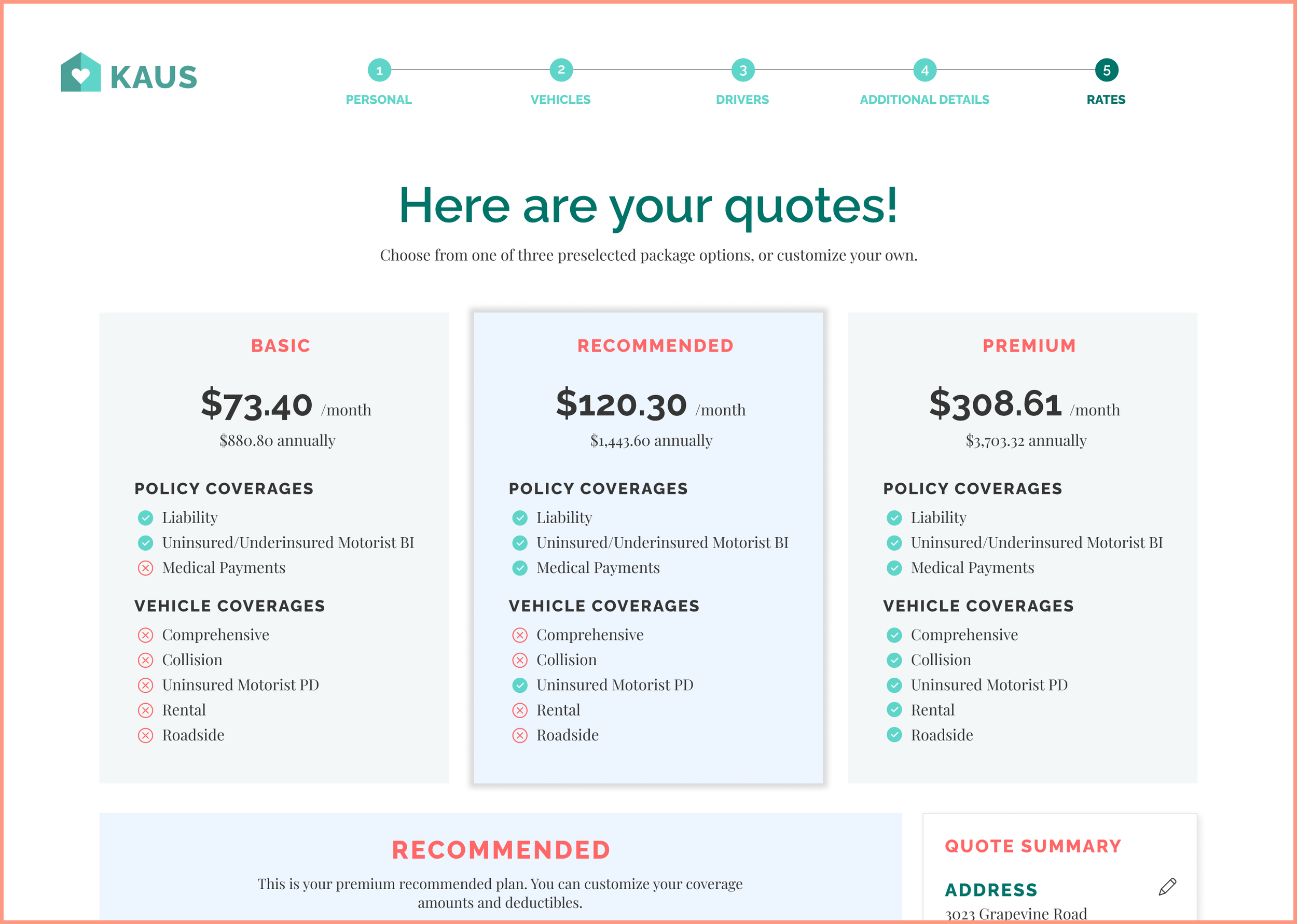
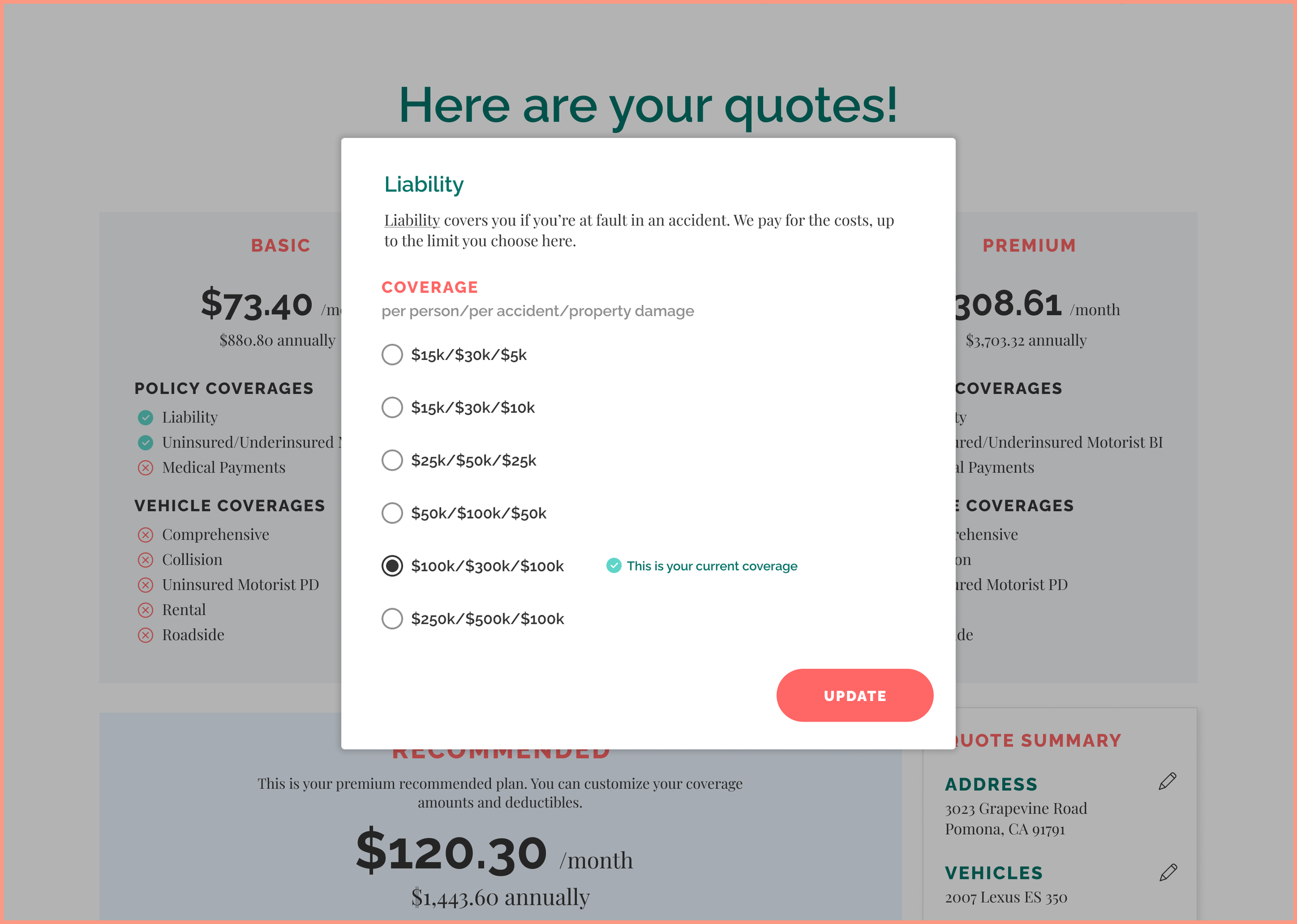
Most people reported feeling intimidated by having too many insurance packages to choose from, but also wanted the flexibility of having different package options. To solve for this, I minimized the available package options at the beginning of the shopping journey, but ensured that customers knew they could customize the packages if they wanted to. At the end of the quote process, customers could choose from 3 basic package options and adjust each package as needed.
Testing
How easily were users able to understand and purchase insurance?
A total of 12 usability tests were run, including 8 self-guided tests via Maze.com and 4 moderated tests. Participants ranged in ages 21-54 and had varying levels of experience shopping for insurance.
Participants expressed positive feedback.
✓ Participants agreed that information is clear and straightforward and it makes insurance seem more approachable than traditional insurance sites.
✓ Participants found sufficient information to comfortably proceed with a quote.
✓ Participants smoothly completed the quote process and understood the quote comparison page.
✓ Participants reported that the information architecture was clear.
Feedback to consider.
· Participants expressed enjoying having the chat tool; however, there were differences in whether they preferred live or automated chat.
· One participant mentioned that the pictures in article cards have a look like stock images or feel baity.
What I learned
Before solving a problem, it's important to understand where user frustration stems from. When tasked with creating a "modern and approachable" e-commerce website, it's common to hold your own assumptions about what that means. Market and user research challenged these assumptions and allowed me to understand the common frustrations of customers with varying levels of insurance experience. This allowed me to focus on features and capabilities that would provide the most value to customers based on their pain points prior to designing.